

/https%3A%2F%2Fprofilepics.canalblog.com%2Fprofilepics%2F1%2F0%2F100183.jpg)
/https%3A%2F%2Fstorage.canalblog.com%2F03%2F02%2F119589%2F96711876_o.jpg)
/https%3A%2F%2Fstorage.canalblog.com%2F11%2F31%2F119589%2F94773502_o.jpg)
/https%3A%2F%2Fstorage.canalblog.com%2F20%2F83%2F119589%2F94772815_o.jpg)
/https%3A%2F%2Fstorage.canalblog.com%2F26%2F72%2F119589%2F75604929_o.jpg)
/https%3A%2F%2Fstorage.canalblog.com%2F59%2F60%2F119589%2F26458628_o.jpg)
Sotheby's New York Contemporary Art Evening Auction achieves $242,194,000
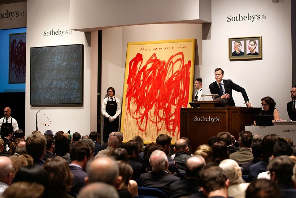
Cy Twombly’s Untitled (New York City) was the highlight of the sale, selling for $36,650,000. Photo: Sotheby's
NEW YORK, NY.- Grégoire Billault, Head of Sotheby’s Contemporary Art Department in New York: “Tonight we achieved exactly what we set out to do: tailor a sale to the market’s current taste. You only had to count the number of hands in the air for works as diverse as the 2012 Ghenie, Calder from the Barr Collection, and sublime paintings by Sam Francis and Francis Bacon to see that collectors continue to show up when presented with great and rare works of art. The sustained bidding from colleagues in Asia as well as Europe and the US underscored the strength of our team, both new and long-tenured, and their relationships with clients around the globe.”
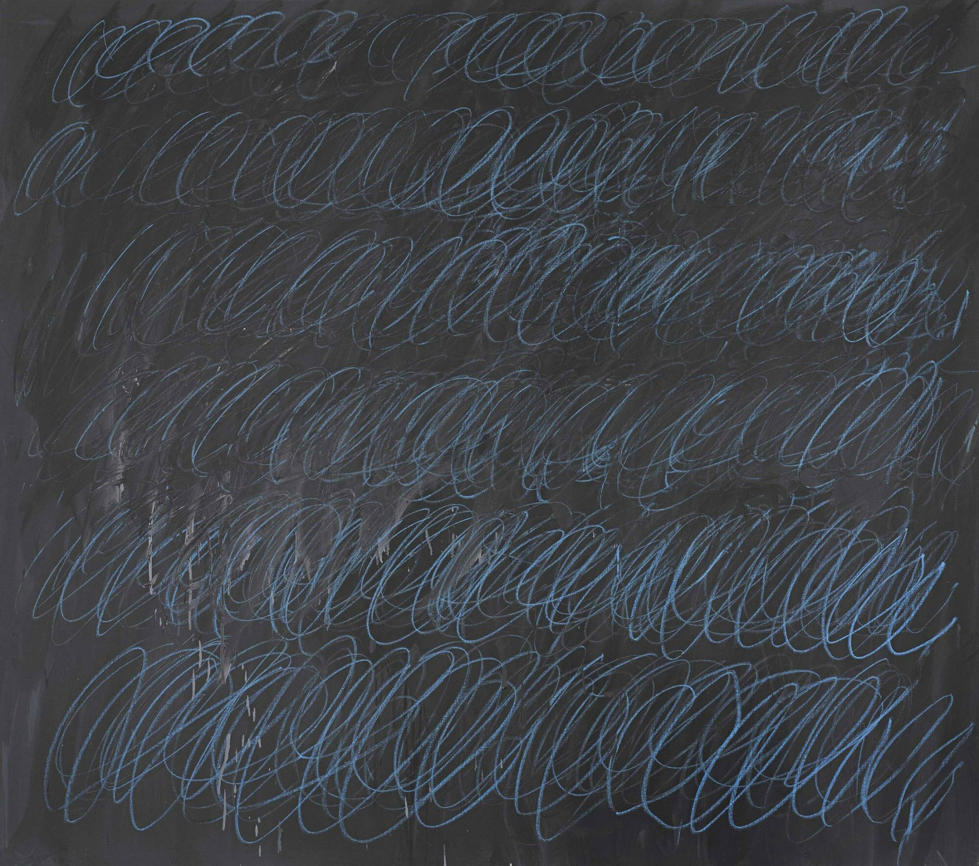
Lot 21. Cy Twombly (1928 - 2011), Untitled (New York City), signed and dated NYC 1968 on the reverse, oil based house paint and wax crayon on canvas, 60 by 68 1/8 in. 152.4 by 173 cm. Estimate Upon Request. Lot sold 36,650,000 USD to an Anpnymous. Photo Sotheby's.
Provenance: Leo Castelli Gallery, New York (LC #57)
Acquired from the above by the present owner in January 1969
Literature: Heiner Bastian, Ed., Cy Twombly: Catalogue Raisonné of the Paintings, Volume III, 1966-1971, Munich, 1994, p. 127, no. 52, illustrated in color.
RHAPSODY IN BLUE: SHATTERING FORM IN UNTITLED (NEW YORK CITY)
Cy Twombly’s majestic Untitled (New York City) of 1968 is the enduring material triumph of a simply unrepeatable moment in the history of art. An unparalleled exemplar of the artist’s most hallowed series of 'Blackboard' paintings, the present work stands as the phenomenal vestige of an exceptional epoch. Untitled (New York City) reflects a period of great convergence in postwar art, when the titanic modes of Abstract Expressionism, Minimalism and Pop Art proposed competing philosophies for the grand trajectory of progressive innovation. Twombly’s reverberating loops refract these overlapping spheres of influence. Aesthetically, his painting announces a subjective and emotive expressivity; conceptually, it embraces a cerebral and minimalistic rationality; and in its essential spirit it broadcasts a new communicative universality. Within the remarkable arena of this specific canvas, Twombly forges a new visual language and ultimately achieves a visual poetry that is beyond sublime. Untitled (New York City) stands as tangible testimony to Twombly's staggering innovation and inimitable abstract aesthetic at this point in his career, as explicated through the work's visceral imagery, stunning color, compositional economy, and graphic intelligence. Having remained in the same collection for over forty years since it was acquired from the artist immediately after it was executed, Untitled (New York City) has never been loaned for exhibition, nor seen in public. The narrative of the painting’s acquisition affirms its rarity: upon introduction from a close artist friend, the present owner visited Twombly’s studio on The Bowery in Manhattan's Lower East Side, and personally chose Untitled (New York City) from among a selection of paintings that Twombly had unrolled for his viewing. In the same year that Twombly paintedUntitled (New York City), he opened his first one-person museum exhibition in the United States at the Milwaukee Art Center—a pivotal period of artistic maturity that heralded his triumphant return to painting following a hiatus in his production from 1964-66. Crucially pre-dating a fundamental shift in Twombly’s status from promising young artist to established modern master, the present work enshrines an attitude of unadulterated innovation and artistic discovery. It is, in short, the very pure manifestation of Cy Twombly's indisputable genius.

View of a large crowd of men as they wait outside the closed doors of the Bowery Mission (227 Bowery), New York, New York, circa 1968. Photo: Fred W. McDarrah/Getty Images
Spectacularly rare for the serenely beautiful blue color of its endlessly lyrical circular lines, and boasting a superb provenance, this canvas is unquestionably positioned as one of the great achievements of Cy Twombly's career. Spanning an immersive expanse of over twenty-eight square feet, it sits amongst an elite cadre of large-scale works of the series, and invites the spectator to become engulfed within its epic drama. Many of the paintings comparable in scale and execution belong to the world’s most renowned museums and institutions, including: The Museum of Contemporary Art, Los Angeles; The Menil Collection, Houston; The Solomon R. Guggenheim Museum, New York; and the Benesse House Museum, Naoshima. However, unlike every other 'Blackboard' painting that bears white loops, the rare colored marks here resound with great vivacity and drama—the present work is the only painting from the series executed in blue. The seemingly frenzied dispersion of graphic mark-making is in fact the result of finely-honed technical precision: the progressive march of elliptical repetitions is expertly rendered to achieve an irresistibly hypnotic urgency. This stark, graphic linearity cascades across a highly seductive gray ground rendered through a forceful assault of brushwork. The variegated tonal architecture of grisaille hues functions like geological strata, having trapped within its oil layers the shadows of drips, smears and strokes. Indeed, the sheer force of this painting's dynamic energy marks it apart from all contemporaneous examples of the grand cycle, and results in a panoramic expanse pulsating with the expansions and contractions of a certain organized chaos. The torrent of luscious vertical drip marks that cascade down the lower left quadrant of Untitled (New York City) enhance the expressiveness of the painting. This vigorous action results in a surface that exposes Twombly’s process of inscription and erasure, possessing a composition of loops that reveal their own creation. Despite a residual yearning to decipher these written marks as an inherently human need, Twombly's visual language has neither syntax nor logic: in the words of Pierre Restany, it is comprised of "furtive gestures, an écriture automatique," (Pierre Restany, The Revolution of the Sign, 1961) and function as a compulsory sensual and intellectual catharsis that is both universal and particular to the individual.
Four years after the artist's death and with ever increasing perspective on the monumental arc of his six-decade career, it is possible today to reflect more substantively on the nature of his incomparable contribution to art history. Following his work as a cryptographer in the United States Army, it is clear from the nature of his early mark-making that he was fundamentally captivated by terms of visual communication, and determined to interrogate associative sign systems and Saussurian semiotics. According to the black and white paintings of the later 1950s, he was evidently drawn to boundaries between the figurative and the abstract, following the course of Picasso and de Kooning in charting an individualistic lens onto the natural world around us. His breakthrough in 1959 with Poems to the Sea, executed in a sudden cathartic outpouring in Italy, demonstrated his definitive debt to the great lessons of history, with European Antiquity and the Renaissance proving the ultimate benchmark and springboard to his art thence forth. This grand inquiry into the past was continued through the ecstatic Baroque paintings of the early 1960s, ultimately culminating with the cycle Nine Discourses on Commodus (Guggenheim Bilbao Museo), completed in the winter of 1963 following Twombly's return from an extended trip to Egypt, Sudan, and Italy. This group of nine canvases based on the murder of the Roman emperor Aurelius Commodus was shown in New York in 1964; the exhibition was received by scathing critical reviews, after which Twombly severely slowed his production. The artist made only 20 canvases in 1964 and none in 1965—a period of radically halted output from which the artist later emerged with a cycle of phenomenal grey-ground paintings.

Eadweard Muybridge, Sequence with hand movement, Plate 535 from ‘Animal Locomotion’, 1887. Alinari / Bridgeman Images
Twombly’s series of 'Blackboard' paintings—as they would come to be known following Robert Pincus-Witten’s seminal text in 1968—revived the artist’s career following a troubling period in the early part of the decade. In 1966, Cy Twombly abandoned the emotive use of color that had defined much of his earlier output to embark upon a cycle of gray canvases in search of a more expressive clarity. As Heiner Bastian has deftly explained, "Cy Twombly tries to shatter form as well as its concomitant intellectual and narrative history in a kind of relativism, reducing it to a rationality of 'black and white' that is at the same time the structural sum of all movement." (Heiner Bastian, ed. Cy Twombly: Catalogue Raisonné of the Paintings, Volume III 1966-1971, Munich, 1994, p. 23) Extraneous literary and historical concerns were cast aside as Twombly sought to channel the vitality of his wrist towards exploring the expressive possibilities of autonomous rhythmic repetitions. He was fascinated by the musical theory of Counterpoint, Palmer handwriting drills, André Masson's automatic drawing and Paul Klee's Pedagogical exercises. The repetition of forms also recalls Futurist investigations into the photographic and cinematic decomposition of forms in motion, such as those exemplified in Umberto Boccioni's States of Mind III: Those Who Stay, and indeed by others such as Marcel Duchamp's with his kinetic Nude Descending a Staircase. Owing inspirational debt to the scientific notebook drawings of Leonardo da Vinci, Twombly saw within the Renaissance master's innumerable scientific formula, scattered drawings and codes, a private poetry of obsession; something driven by an irrational demon of secret knowledge which struck a chord with Twombly's own aesthetic. Above all though, perhaps it was the realization that the Renaissance clarity and light so often used to describe Italian art were balanced by a darker, neurotic intensity. This is reflected by the destructive and turbulent themes of Leonardo's work to which Twombly was consistently drawn in the late 1960s: those of maelstroms and cataclysms.

Kazimir Malevich, Black Square, Blue Triangle, 1915. Stedelijk Museum/Amsterdam/The Netherlands. Erich Lessing / Art Resource, NY
Twombly approached the issue of movement and time within pictorial space by reconsidering artists like Leonardo, Duchamp, and the Italian Futurists, who would conceive mythology and history through abstract principles. With his 'Blackboard' paintings, Twombly investigated the development of time and space within the picture plane; the spectacular scale of the present work and the exuberance of the blue crayon amplify the torrential storm of Twombly’s whirlwind shapes. Especially against their gray ground, the blue oval scrawls emerge from and recede into another in dense relief, teetering on the threshold of legibility while electrifying our sight with their vivid hue. Pulsing with an ineffable rhythm as the oblong loops splinter across the canvas, Twombly here investigates the definition and physical nature of a simple geometrical element in space as it erupts within the picture plane with cataclysmic graphic narrative. The six magnificent horizontal bands of loops increase in volume and expressive abandon, as the artist progresses down the length of the canvas—Twombly’s lassoed lines progressively lose regularity and control, resulting in thrillingly increased drips, smears, and spatters toward the bottom of the picture. While the Futurist principle of movement in space was centered on the rational, quasi-scientific understanding of transformation and duration, Twombly appears to have reacted to the dispersion of forms in which painstaking precision comes into contact with an energetic abandon. With all the rough, fractured rawness of street graffiti, Twombly presents an entirely novel visual language that innovatively explores both the most elementary and the most sophisticated concerns posed by the genesis of creativity.

Barnett Newman, Onement VI, 1953. Private Collection, Sold Sotheby’s New York, May 2013. © 2016 Barnett Newman Foundation / Artists Rights Society (ARS), New York
Twombly approached the issue of movement and time within pictorial space by reconsidering artists like Leonardo, Duchamp, and the Italian Futurists, who would conceive mythology and history through abstract principles. With his 'Blackboard' paintings, Twombly investigated the development of time and space within the picture plane; the spectacular scale of the present work and the exuberance of the blue crayon amplify the torrential storm of Twombly’s whirlwind shapes. Especially against their gray ground, the blue oval scrawls emerge from and recede into another in dense relief, teetering on the threshold of legibility while electrifying our sight with their vivid hue. Pulsing with an ineffable rhythm as the oblong loops splinter across the canvas, Twombly here investigates the definition and physical nature of a simple geometrical element in space as it erupts within the picture plane with cataclysmic graphic narrative. The six magnificent horizontal bands of loops increase in volume and expressive abandon, as the artist progresses down the length of the canvas—Twombly’s lassoed lines progressively lose regularity and control, resulting in thrillingly increased drips, smears, and spatters toward the bottom of the picture. While the Futurist principle of movement in space was centered on the rational, quasi-scientific understanding of transformation and duration, Twombly appears to have reacted to the dispersion of forms in which painstaking precision comes into contact with an energetic abandon. With all the rough, fractured rawness of street graffiti, Twombly presents an entirely novel visual language that innovatively explores both the most elementary and the most sophisticated concerns posed by the genesis of creativity.

Roy Lichtenstein, Drowning Girl, 1963. The Museum of Modern Art, New York, NY, U.S.A. Digital Image © The Museum of Modern Art / Licensed by Scala / Art Resource, NY © Estate of Roy Lichtenstein
Twombly was conscripted to the military from November 1953 – August 1954. During these years of service, the artist was assigned first to Camp Gordon in Augusta, Georgia, and then the Pentagon in Washington, D.C. It was there that the artist worked as a Cryptologist, studying the art of writing and solving codes. The artist often drew at night after lights out, producing a group of works that initiated his motif of ‘scribbling’ and laid the foundation for much of his subsequent work. Drawing in the dark excised the sense of reason and rationality associated with the eye; instead, Twombly liberated his graphic activity from optical control and made his hand alone responsible for form, thereby encouraging instantaneity and the unanticipated. Such techniques evolved out of Surrealism—abandoning inhibitive self-consciousness, blind composition was a method of automatism taught by leading figures such as André Breton and André Masson. Around this time, Abstract Expressionist artists seized on the influence of European Modernism and adopted considerable interest in glyphs and modes of primitive communication. This attention to the symbols of archaic societies and their inherently expressive power were a natural point of departure for these New York School painters, for whom the power of simple expressive abstract signs to communicate held clear associations to their own modes of gestural abstraction at the time.

Yves Klein, ANT 130, 1960. Museum Ludwig, Cologne, Germany. Banque d’Images, ADAGP / Art Resource, NY © 2016 Artists Rights Society (ARS), New York / ADAGP, Paris
Twombly found, in the relative coolness of the dark-ground style, an appropriate form of work to pursue in New York. Working from studios on the Bowery and Canal Street, the relative chasteness and severity of his new aesthetic compared to the sensual pleasures of the early 1960s seemed more in sync with contemporary trends in America. The present work ushered in a rediscovered Americanness in Twombly’s work, reflecting the contemporary artistic discourse in marked contrast to the Europeanness of his earlier works. In Untitled (New York City), the freedom of movement of course evokes the liberal energy of Jackson Pollock's action painting, while the all-over but low-pressure imagery is similar to Jasper Johns’ grey paintings. The immersive nature of vast canvas expanses and, as critically and uniquely broadcast in the present work, submersion in the force of color, afforded an experience comparable to that generated by Rothko and Newman. The pared-down aesthetic of this painting and an unobtrusive cool objectivity also owes a significant debt to the protagonists of Minimalism including Judd, Andre and Flavin. The resulting canvases, such as Untitled (New York City), are considered without a doubt the most powerful and lyrical works of his career. Chromatically sparse and formally reductive, the gray-ground pictures demanded new modes of reading Twombly’s work with relation to the artistic developments pulsing through New York City. The present work stands apart, however, for the vibrancy of its blue palette; a characteristic that reflects the artist’s richly colorful and expressive compositions from the first half of the 1960s known as Baroque Paintings. Kirk Varnedoe explains, “Just as those earlier pictures had represented a cooling shift away from painterly and erotic energies, these new canvases were lean and unemotional, in contrast to the baroque color and violence of the work of the early 1960s… That temporal aspect was then extended through the gray-ground works of the next few years, in the frequent imagery of analytically segmented movement… Twombly’s previous attraction to the evidence of deep, slow, ‘vertical’ time, in scarred surfaces, here is translated into a fascination for the forms of ‘lateral’ speed, forms and forces rushing by with their proliferation of marks more rationally divided than confoundingly layered.” (Kirk Varnedoe, ‘Inscriptions in Arcadia’ in Nicola del Roscio, Ed.,Writings on Cy Twombly, Munich, 2002, pp. 215-6)
Giacomo Balla, Velocità di motocicletta (The speed of the motorcycle), 1913. Private Collection.
These are forms that insist on a progressive linear continuity, but simultaneously concede to isolated bursts of irregular activity. Unlike Twombly’s earlier canvases, in which episodes of personal expression are scattered across the picture plane, the artist here constricts his activity to a gestural framework—nevertheless, the lassoed bands give way to expressive subjectivity in their vigorously imprecise execution. Like the work of Minimalist artists who pursued a repetitive, doggedly systematic task—such as Kusama’s looped Infinity Nets, Lewitt’s serial pencil-drawn lines on the wall, or Uecker’s intricately nailed surfaces—Twombly’s painting experiments with the unplanned personal inflections that can arise from following strict conventions, a departure from ideals of purely spontaneous expression. At moments, the line is tight and dense; at others, Twombly loses control and his cursive energy drives off course, a high-speed choreography in which individual events of personal expression are sublimated into a greater whole of dense accumulations. Within this dichotomy lies the very brilliance of Twombly’s painting: reveling in the contradictions between the systematic and the irregular, the unruly and the cerebral, the premeditated and the intuitive, Twombly achieves a balletic complexity unsurpassed by any of his contemporaries. Twombly recalls being taught to write using the Palmer method, a strict technique of teaching handwriting that required pupils to repetitively practice rote drills keeping their fingers and wrists rigid while only moving their arms. In the lattice of tiered lateral ovals scoring the canvas, Twombly’s own gestural abandon erupts from the structural balance of the composition; while more precise and mathematical than the automatism of the Surrealists or the impulse of the Abstract Expressionists, Twombly’s subjectivity seeps through what appears to be mechanical labor. Like the individual strokes of encaustic that burst forth through the predetermined grids and formats of a Jasper Johns painting, Twombly’s loops similarly bely in subtle disobedience a totally objective geometric precision. With the rigid syntax and rudimentary forms of the grey-ground paintings, Twombly appears to deny the insouciance of personality; however, the tremulous inflections of each parabolic rise and fall inevitably give way to the signature intensity of the artist’s own hand. Varnedoe comments, “As before, Twombly courts the accusation that there is no mind involved—previously, because the manner seemed chaotically subjective, without sufficient ordering control, too episodic and too little marked by work; and now, because it seems mechanically rote and impersonal, too monotonous and too completely a matter of work. No familiar evidence of heroic spontaneity or intuited compositional judgment, nor any universal coordinate such as geometry, anchored the pictures’ claim to attention.” (Kirk Varnedoe, “Inscriptions in Arcadia” in Exh. Cat., New York, Museum of Modern Art, Cy Twombly: A Retrospective, 1994, p. 42)
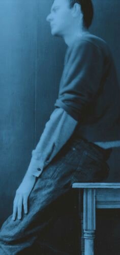
Robert Rauschenberg, Untitled (Cy sitting), 1952 Photo © Robert Rauschenberg Foundation/Licensed by VAGA, New York, NY
For Twombly the 'Blackboard' paintings represented emancipation from the associative constrictions of his preceding oeuvre: a new dawn in his epic art as attested by Robert Pincus-Witten in a contemporaneous review: "Handwriting has become for Twombly the means of beginning again, of erasing the Baroque culmination of the painting of the early 1960s... beautiful writing has been submerged within a Jasper Johns-like gray field. Put bluntly, it has been drowned in a schoolmaster's blackboard." (Robert Pincus-Witten, "Learning to Write," 1968, in Nicola del Roscio, Ed., Writings on Cy Twombly, Munich, 2002, p. 56) Almost five decades after its creation, this remarkable triumph of twentieth-century Art History remains still an enduring means of "beginning again."

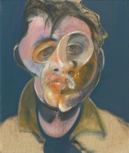
Francis Bacon (1909-1992), Two Studies for a Self-Portrait (1970), signed, titled and dated 1970 on the reverse of each panel, oil on canvas, in two parts: each: 14 by 12 in. 35.5 by 30.5 cm. Estimate 22,000,000 — 30,000,000 USD. Lot sold 34,970,000 USD to an Anonymous. Photo Sotheby's.
This work will be included as number 70-07 in the forthcoming Francis Bacon Catalogue Raisonné, being prepared by the Estate of Francis Bacon and edited by Martin Harrison.
Provenance: Marlborough Fine Art Ltd., London
Acquired from the above by the present owner in 1970
Exhibited: Paris, Galeries Nationales du Grand Palais; and Dusseldorf, Kunsthalle Düsseldorf, Francis Bacon, October 1971 - May 1972, p. 131, no. 103, illustrated
London, Marlborough Fine Art Ltd., Francis Bacon 1909-1992: Small Portrait Studies, October - December 1993, n.p., no. 20, illustrated in color and n.p., illustrated in color (detail of the left panel)
John Russell, Francis Bacon, London, 2001, illustrated in color on the cover (detail of the right panel)
Notes: “…He was never more brilliant, more incisive or more ferocious when it came to depicting himself. In this he helped revive a genre, and Bacon’s Self-Portraits can now be seen as among the most pictorially inventive and psychologically revealing portraits of the Twentieth Century.” (Michael Peppiatt in Exh. Cat., Rome, Galleria Borghese, Caravaggio Bacon, 2009, p. 210)
"The single head, fourteen inches by twelve, was from 1961 onwards the scene of some of Bacon's most ferocious investigations. Just as a gunshot sometimes leaves an after-echo or parallel report, so these small concentrated heads carry their ghosts within them." (John Russell, Francis Bacon, London, 1993, p. 99)
“Confronted by Bacon’s paintings we are compelled by sensations. We are affected viscerally and physiologically, and they act on the nervous system before the intellect: we feel them before we analyze them, but they remain open to diverse modes of interpretation, resisting conformity with any one philosophical system.” (Martin Harrison, ‘Painting, Smudging,’ in Martin Harrison, Ed., Francis Bacon: New Studies, Germany, 2009, p. 166)
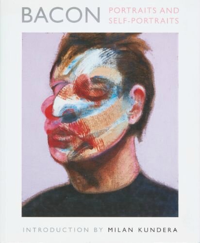
“Of course we are not certain that the depths really do harbor something—but whatever it may be, we each of us have in us that brutal gesture, that hand movement that roughs up another person’s face in the hope of finding, in it and behind it, a thing that is hidden there.” (Milan Kundera, ‘The Painter’s Brutal Gesture’ in Bacon: Portraits and Self-Portraits, New York, 1996, p. 10)
“Bacon’s portraits are the interrogation on the limits of the self. Up to what degree of distortion does an individual still remain himself? To what degree of distortion does a beloved being still remain a beloved being? For how long does a cherished face growing remote through illness, through madness, through hatred, through death still remain recognizable? Where lies the border beyond which a self ceases to be a self?” (Milan Kundera, ‘The Painter’s Brutal Gesture’ in Bacon: Portraits and Self-Portraits, New York, 1996, p. 12)
In 1970, Francis Bacon found himself at the pinnacle of his personal and professional lives. Months before the opening of his groundbreaking career-defining retrospective at the Grand Palais in 1971, the artist was 61 years old and in the throes of his torrid, passionate love affair with George Dyer. The breathtaking creative fecundity of the years up to and including 1970 was owed predominantly to the impact of Bacon’s relationship with Dyer, which began in 1964 when Dyer broke into Bacon’s studio at 7 Reece Mews with the intent of burgling the place. Through the studio’s famous skylight, Dyer tumbled into Bacon’s life like a piercing ray of light, truly falling from above and forever altering the course of the artist’s work. Their relationship was marked by a polarity of extremes: ardent infatuation and enchanted desire, foiled by the progressive impatience Bacon felt towards the increasing aimlessness and erratic behavior that exacerbated his lover’s worsening alcoholism. This intensity of emotion resulted in paintings that wield the full force of Bacon’s vigor and pictorial authority, which reached its absolute crest in 1970—just one year before tragedy would strike Bacon once again, with Dyer’s death in 1971 driving him into a spiral of grief. The artist’s exhilarating 1970 diptych, Two Studies for a Self-Portrait, however, meets Bacon at a critical juncture before Dyer’s imminent death would consume him entirely. In these two portraits, we happen upon the artist caught in a transitional mental state, wrestling with the rapturous emotional depth and psychological complexity of his relationship with Dyer, all the while in the full swings of preparation for the most important milestone of his career.
Two Studies for a Self-Portrait is indisputably the singular icon of the artist’s legendary canon of self-portraiture, having graced the covers of Milan Kundera and France Borel’s definitive 1996 publication Francis Bacon: Portraits and Self-Portraits, and John Russell’s seminal 2001 monograph Francis Bacon. A treasure of inconceivable rarity, not only is this painting the lone work painted in 1970 ever to appear publicly for sale, but it is one of only three Self Portrait diptychs executed in Bacon’s famed 14 by 12-inch format. Exhibited only twice—first at the Grand Palais, and then in an exhibition of the artist’s Small Portrait Studies at Marlborough Fine Art in London in 1993, for which it was selected as the poster image—this unparalleled masterwork has remained out of the public eye in the same esteemed private collection for the past 46 years since having been acquired in the year of its creation. An exceptional work, therefore, that possesses an equally exceptional exhibition history, Two Studies for Self-Portrait was hand chosen by the artist for inclusion in the single most important exhibition in Bacon’s lifetime: the grand scale retrospective held at the Grand Palais in 1971 (an accolade only previously afforded to Pablo Picasso among living painters). Directly following this exhibition, the critic for Le Monde Michel Conil Lacoste, praised the “perfectly selected and installed masterworks”: “It’s more than a successful exhibition. Everything has come together for this retrospective, in preparation for the past two years, an event marked by exceptional signs: the power and the radical originality of a painter… the renewal he draws from an exploration of the human and the quotidian and the classical métier one thought was exhausted...” (Michel Conil Lacoste quoted in Exh. Cat., London, Tate Britain (and travelling), Francis Bacon, 2008, p. 36).
The right panel of the present work illustrated on the cover of Milan Kundera, Bacon: Portraits and Self-Portraits, 1996. Courtesy Thames & Hudson, London © The Estate of Francis Bacon. All rights reserved. / DACS, London / ARS, NY 2016
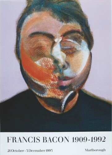
The left panel of the present work illustrated on the poster for the exhibition Francis Bacon 1909-1992: Small Portrait Studies, Marlborough Fine Art Ltd., October – December 1993. Courtesy Marlborough Fine Art © The Estate of Francis Bacon. All rights reserved. / DACS, London / ARS, NY 2016
Charged with sublime beauty and framed within an electric arena of brilliant color, these two portraits masterfully combine Bacon’s twisted, scraped, and gushed handling of paint with arresting intensity and consummate psychological depth. Exquisite pastel tones are entwined and offset by lush, electric swathes of orange, pink, and blue squeezed directly from the tube, further punctuated by alabaster accents that work to illuminate the entire painting. Alternating between thick smears of abstracted color and precise, naturalistic renderings of the artist’s own physiognomy, the present work sees the artist tussling with his own appearance. Here he oscillates between realism and the artifice of self-presentation; John Richardson remarked of Bacon’s faces, “Those strange revolving brushstrokes, that are so familiar from his pictures, would be rehearsed with Max Factor pancake make-up. He had a series of these Max Factor pots and he would take one and do a sort of smear across his face, and these are the smears that you see on so many of the faces of those early paintings.” (John Richardson quoted in Francis Bacon: Taking Reality by Surprise, London, 1996) Bravura brushwork and whipped impasto share the picture plane with elegant impressions of corduroy and torn cloth that imprint vigorous pattern onto the surface of the face; the striped passages weave around the curvature of Bacon’s head and extend seamlessly into his ruffled coiffure. In thrilling evidence is the artist’s distinctive forelocks of hair, those inimitable diagonal brushmarks which the esteemed French poet, and friend of Bacon’s, Michel Leiris described as “a reckless comma staunchly inscribed across his brow.” (Michel Leiris, Francis Bacon Full Face and in Profile, New York, 1983, p. 12).

Francis Bacon, early 1970s, by Peter Stark, 20.4 x 25.1 cm (RM98F1A:116). Collection: Dublin City Gallery The Hugh Lane. Photograph Courtesy of Peter Stark, copyright unknown. Source clipping © The Estate of Francis Bacon. All rights reserved. / DACS, London / ARS, NY 2016
Unlike other examples of Bacon’s small-format portrait studies, Two Studies for a Self-Portrait does not convey an entirely mangled appearance: the savage brushstrokes and riotous color connote a dislocation of facial features, but the tenderness with which Bacon approaches his own face in this buoyant self-portrait evades utter disfigurement. Captured brusquely mid-motion, Bacon’s faces conjure a restlessness of inner thought and intense concentration, but avoid the bruised lacerations and wounded defacements that mark his more tragic self-portraits. With sumptuous inflections of paint, Bacon’s facial distortions interrogate the limits of the self. Amid the spectacular color and virtuoso brushwork, Bacon presents an ethereal and unearthly form of his visage that, while undoubtedly depicting the artist, is manifestly surreal. In the left panel, the artist’s right cheek is smeared with a single stroke of searing orange that swoops across his jawline, his entire visage reverberating with the velocity of the brush as if recovering from a blow to the face; in the right panel, the center of his head tremors with violent smudges. But, this is not a mark of pure brutality. While the pulpy arcs and swoops of oil paint rough up Bacon’s features, the artist’s insistence on chance, play, and radiant prismatic color invoke what Kundera refers to as ‘joyous despair’: a counter-balance between the artist’s serious confrontation with mortality and the intense desire and enchantment that these effusive pictures set forth. Two Studies for a Self-Portrait approaches the physical materiality of human existence in its insistence on the corporeality of flesh as real and concrete; Bacon expresses this pure, indisputable fact as enduringly in tandem with an inner, metaphysical essence. Kundera explains, “It is neither pessimism nor despair, it is only obvious fact, but a fact that is veiled by our membership in a collectivity that blinds us with its dreams, its excitements, its projects, its illusions, its struggles, its causes, its religions, its ideologies, its passions. And then one day the veil falls and we are left stranded with the body, at the body’s mercy…” (Milan Kundera, ‘The Painter’s Brutal Gesture’ in Bacon: Portraits and Self-Portraits, New York, 1996, p. 17) What makes the present work so special is its insistent disavowal of pessimism: Bacon accesses his own mortality while privileging the magical quality of dream, chance, and the imagination, which surpass the evanescence of the physical body.

Francis Bacon, early 1970s by Peter Stark, 20.4 x 25.1 cm (RM98F1A:116). Collection: Dublin City Gallery The Hugh Lane. Photograph Courtesy of Peter Stark, copyright unknown. Source clipping © The Estate of Francis Bacon. All rights reserved. / DACS, London / ARS, NY 2016
The deeply striking instantaneity of the present work can be attributed greatly to the manner in which Bacon very deliberately painted the background. Bacon was a compulsive revisionist and very often traces of differently hued layers are visible underneath the final background coat. The individual panels of Two Studies for a Self-Portrait, however, reveal no such underpainting. Instead, the bright, flat lilac background follows closely the extemporaneous articulation of Bacon’s head and shoulders, leaving areas of grazed pigment that reveal the raw canvas beneath. Against this purposeful background, the interplay and great choreography of agitated brushstrokes in white, blue, and red posit this as a work of extraordinary elegance and vibrancy. The rich density of oils that comprise the facial forms are amplified in intensity against the flatness of the background and simplicity of his black jumper.

Claude Monet, The Houses of Parliament, London, with the sun breaking through the fog, 1904. Musée d’Orsay, Paris, France / Bridgeman Images
Cut off from the natural world by its searing, pungent tonal spectrum, Bacon’s palette occupies the realm of the imagination. With dropped eyelids perched against his muscular cheekbones as if closed, and lips tightly pursed in deep contemplation, Bacon’s heads appear to be captured in a liminal state of mental reflection. His severely introspective expressions coupled with the enchanting color palette indicate a dream-like state nestled within his subconscious psyche. Martin Harrison discusses this crucial connection between Bacon’s technique of turbulent smudges and its greater philosophical resonance. Harrison in fact quotes Gaston Bachelard to suggest the smudged features in Bacon’s portraits indicate a state of transition: “Gaston Bachelard discussed the phenomena of dreaming and transitional states thus: ‘if it is true that the psychology of the imagination neither can nor should work upon static figures—if it can only learn from images that are in the process of deformation, it will be agreed that this most amorphous of objects must be one of the most valued oneiric themes. For does it not give access to a world of shapes in movement and deformed by movement, and lend itself to constructions whose constant mutations bring the formal powers of dreaming fully into play?’” (Martin Harrison, ‘Painting, Smudging,’ in Martin Harrison, Ed., Francis Bacon: New Studies, Germany, 2009, p. 166).

Willem de Kooning, Woman, 1949. Private Collection. © 2016 The Willem de Kooning Foundation / Artists Rights Society (ARS), New York
If Bacon’s portraits are indeed meant to affect a level of sensation beyond the purely physiological, there is perhaps no more intimate an investigation of the artist’s psyche than Two Studies for a Self-Portrait. Bacon was quoted at length describing how he instinctually pushed paint around to get as close as possible to a “deep well from which things are drawn out, a reservoir of the unconscious.” (Francis Bacon quoted in Hugh Davies and Sally Yard, Francis Bacon, New York, 1986, p. 110) It is perhaps Milan Kundera, however, who best described Bacon’s painterly triumph in his introduction for the publicationBacon: Portraits and Self-Portraits, on whose cover the present work is featured. Kundera wrote: “Of course we are not certain that the depths really do harbor something—but whatever it may be, we each of us have in us that brutal gesture, that hand movement that roughs up another person’s face in the hope of finding, in it and behind it, a thing that is hidden there.” (Milan Kundera, ‘The Painter’s Brutal Gesture’ in Bacon: Portraits and Self-Portraits, New York, 1996, p. 10) When faced with his own image, Bacon turned to the brush as a tool by which to excavate and discover a hidden layer of meaning from within his nervous system. Bacon explicitly declared his disavowal of religion and any existence of a soul, maintaining the uniform conclusion that mind, nervous system, and body exist as one. While delicately imprinted, the parallel lines that score Bacon’s doubled heads appear as scratches across his face, marking a state of deformity that perhaps best visualizes Kundera’s concept of “the brutal gesture”: it is as if the viewer bears witness to the artist clawing at his own corporeal being to dig out his inner essential subconscious. As Bacon remarked, “When talking about the violence of paint, it’s nothing to do with the violence of war. It’s to do with an attempt to remake the violence of reality itself.” (Francis Bacon quoted in Hugh Davies and Sally Yard, Francis Bacon, New York, 1986, pp. 109-110) Rather than setting out to represent fact, Bacon’s self-portraiture approached distortion as a means by which to unlock what lies beneath the surface of appearance—a vehicle for observation into human nature.
Moreover, what makes Two Studies for a Self-Portrait indelibly rare is that in comparison to the 21 single panels and 11 triptych self-portrait studies in the 14-by-12 inch format canvases, Bacon executed a total of only 3 self-portraits in this diptych format. The diptych remains a significant composition for Bacon’s portrait heads, presenting a duality of views that is particularly resonant in its binary composition. The single portrait head became Bacon’s principal subject in 1964, the year he first met George Dyer. In the early part of this year, Bacon commissioned John Deakin to photograph himself, and the other protagonists of his Bohemian Soho enclave, and in so doing was provided with an instant repository of visual cue cards to use as photographic source imagery for his studies. The proliferation of the diptych and triptych format can be attributed to the organization of the contact sheets Deakin provided to Bacon, which arranged each roll of film in four rows of three. This lateral sequencing allowed Bacon to explore not only the nuances of movement, but to probe multiple views of the same subject: a distinctly Cubist device used to Bacon’s advantage in order to depict an emotional, metaphysical complexity. Across these multiplied formats, his portraits—and subsequently, the essence of his subjects—develop before the eye like a photograph. Bacon seems to make the case against any singular perspective on the individual, instead privileging a layered understanding of the human psyche. John Russell described: “Bacon wrenched, reversed, abbreviated, jellified and generally reinvented the human image. The paint-structure was by turns brusque and sumptuous, lyrical and offhand, pulpy and marmoreal. Swerving, pouncing, colliding with itself, taking for granted the most bizarre conjunctions of impulse, it produced a multiple imagery which was quite new in painting.” (John Russell, Francis Bacon, New York, 1971, p. 168) Possessing the ability to catch a subject’s shifting position through both the double format, and the sweeping vertiginous brushstrokes within each panel, Bacon’s portrait studies present a revisionist take on the precepts of Analytical Cubism.

The right panel of the present work illustrated on the cover of John Russell,Francis Bacon, 2001. Courtesy Thames & Hudson, London © The Estate of Francis Bacon. All rights reserved. / DACS, London / ARS, NY 2016
Two nights prior to the opening of Bacon’s retrospective exhibition at the Grand Palais, Dyer was found dead of an overdose in a bathroom at the Hôtel des Saints-Pères. Following Dyer’s passing, Bacon launched into a series of epic eulogies that would lead into his Black Triptychs, which bespeak the artist’s immeasurable loss and grief. Bacon’s Two Studies for a Self-Portrait arrived on the cusp of this significant emotional transition. In the mid-1960s, Bacon was given a book written by Michel Leiris, where he underlined the following passage: “For Baudelaire, beauty cannot come into being without the intervention of something accidental… What constitutes beauty is not the confrontation of opposites but the mutual antagonism of those opposites, and the active and vigorous manner in which they invade one another and emerge from the conflict marked as if by a wound or a depredation… We can call ‘beautiful’ only that which suggests the existence of an ideal order—supraterrestrial, harmonious and logical—and yet bears within itself, like the brand of an original sin, the drop of poison, the rogue element of incoherence, the grain of sand that will foul up the entire system… On the right-hand side, a beauty that is immortal, sovereign, sculptural; facing it, the element of the left, sinister in the strict sense, since the left stands for misfortune, and for accident, and for sin.” (Michel Leiris cited in John Russell, Francis Bacon, New York, 1971, p. 142-3) Just like Leiris, Bacon saw two sides of beauty: both the stable and the unstable, the passion and the tragedy. It is from the tension between opposites and the struggle for balance between two sides that one finds true beauty. By very nature of a process of doubling, the diptych literally and formally articulates for Bacon the power of image and counter-image in dialogue. In two parts, Bacon fragments his appearance into two alike yet unlike images, heightening a plurality of self that is without restrictions.
The ebullient hues and vortex of energy within his sweeping marks in Two Studies for a Self-Portrait relate Bacon’s painting to the outburst of color associated with the development of color field painting, post-painterly abstraction, and the ascendance of the brightly colored Pop Art in the 1960s. In the vivid fields of prismatic color that swerve into one another, Bacon’s faces evoke the deeply saturated chromatic intensity of Mark Rothko’s abstract sectionals from the early 1950s, while their Impressionist vigor and sense of motion recall the most accomplished of Claude Monet’s landscapes. Bacon’s iridescent palette in the present work recounts a heightened exuberance and magnificent imagination from a painter who staunchly opposed idealization, facing humanity for its overwhelming burden of traumas and pain. The bejeweled pinks, blues, and lavenders that erupt from Bacon’s doubled visage are notably present in Perry Ogden’s famed photographs of Bacon’s home and studio on 7 Reece Mews in London’s South Kensington neighborhood, where he moved in 1961 and remained until his death in 1992. As the artist scraped clean the radiant hues of his brush, reworking the layers of his intricate canvas surfaces, we can see the vestiges of his painterly process lining the interior of his studio. This irrepressibly effusive palette demonstrably held a privileged place in Bacon’s repertoire, appearing in a number of Self-Portraits from the late 60s. The 1960s also spawned a proliferation of Technicolor in the public mass media, where color photography, film, and magazines ascended to the status of the norm. Fascinated by color photography and color reproductions in books, Bacon reveled in the heightened artifice and falsified spectrum that the medium enabled: the rich kaleidoscopic color present in Two Studies for a Self-Portrait creates a sense of fiction that shears Bacon’s depiction from the natural world, emphasizing its distance from a photographic reality.

Lucian Freud, Francis Bacon, 1952. Whereabouts Unknown. Album / Art Resource, NY © The Lucian Freud Archive / Bridgeman Images
Already the subject of major international retrospectives and critical scholarship across the globe by the time he painted Two Studies for a Self-Portrait in 1970, Bacon was deeply aware of his prominent status. A man of 61, time inevitably had its cumulative effects on his appearance, and yet in this depiction, Bacon’s features remain remarkably akin to those of a much younger man. This painting does not possess the carved tangle of physiognomic forms or time weariness evident in future self-portraits from the immediate years following the death of George Dyer in 1971; instead, it emanates youthfulness, a tone further embellished by the lively color palette. Alert, tightly jawed, and smooth-skinned below the impastoed sense of movement, Bacon’s painted face belies the age of its author. This indisputably favorable portrayal of his own appearance reflects Bacon’s deep concern with self-presentation, a factor further elaborated by Michael Peppiatt: “… Bacon continued to take great care of his appearance as he grew older, dyeing his hair subtle shades of reddish brown and applying liberal amounts of ‘pancake’ makeup to his face, even though it had not become deeply lined.” (Michael Peppiatt, Francis Bacon: Anatomy of an Enigma, New York, 2009, p. 364) Successor to a genre of self-portraiture perfected by revered masters from Rembrandt to Picasso, Bacon was undoubtedly driven by an incessant compulsion to forge and carefully deliver a well-manicured personal mythology for the experience of his time.
Francis Bacon, Self-Portrait, 1969. Private Collection. Sold Sotheby’s New York, November 2007, ($33.1 million) © The Estate of Francis Bacon. All rights reserved. / DACS, London / ARS, NY 2016
As a genre, self-portraiture purportedly reveals the private side of a public profession; nowhere can this be understood with such forthright candor than in Bacon’s oeuvre as viewed in the light of Rembrandt’s legacy. Rembrandt was the very touchstone of Bacon’s inventiveness in these small scale canvases; the endless variety and successive permutations of his own visage, which meld into almost abstract dissolving matter towards the end of his life, cast Rembrandt’s late self-portraits as a striking parallel to, and even art historical blue-print for, the present work. Bacon believed Rembrandt’s self-portraits to be “formally the most extraordinary paintings. He altered painting in a way by the method by which he dealt with himself and perhaps he felt freer to deal with himself in this totally liberal way… One always has a greater involvement with oneself than with anybody else. No matter how much you may believe that you’re in love with somebody else, your love of somebody else is your love of yourself.” (Francis Bacon quoted in David Sylvester, Looking Back at Francis Bacon, London, 2000, p. 241) When viewed up close, Rembrandt’s heads seemingly disband into a mass of non-representational marks that were doubtless an inspiration to Bacon’s own savage expressivity. Like Rembrandt tallying his aged, lined and weary features with a congruent painterly treatment of disbanded corporeality, in the present work the vaporous dissolution of Bacon’s likeness tempers exigent facture with an intense yet reposed response to the concrete fact of mortality.

Rembrandt van Rijn, Self Portrait at the Age of 63, 1669. National Gallery, London, UK / Bridgeman Images.
Rembrandt van Rijn, Self Portrait, c. 1668-69. Wallraf-Richartz Museum, Cologne, Germany / Bridgeman Images

Pablo Picasso, Head of a Man, 1908. Kunstmuseum, Bern, Switzerland / Peter Willi / Bridgeman Images © 2016 Estate of Pablo Picasso / Artists Rights Society (ARS), New York

Pablo Picasso, Head of a Man, 1908. Musée Picasso, Paris, France © RMN-Grand Palais / Art Resource, NY © 2016 Estate of Pablo Picasso / Artists Rights Society (ARS), New York
Until a certain point in history, portraiture was a means by which to reach an absolute representation of an individual—direct, unambiguous statements of a person’s character and statehood, categorized by identifiers of dress, ownership, and other iconographic markers. At the turn of Modernism, however, artists displayed their disbelief in this structured view of human personality, turning away from a monolithic view of human nature defined by power, and instead to a variable, contingent expression of individuals characterized by flaws and ambiguity. As Bacon’s likeness refracts like a prism throughout and across Two Studies for a Self-Portrait, the spectral mirror of his canvases reveal entirely uncharted emotional depths and psychosomatic complexities buried within the very philosophy of self-reflection.
Lot 17. Sam Francis (1923 - 1994), Summer #1, oil on canvas, 95 1/2 by 72 in. 242.6 by 182.9 cm. Executed in 1957. Estimate 8,000,000 — 12,000,000 USD. Lot sold 11,842,000 USD to a private Américan. Record for artist at auction. Photo Sotheby's.
Provenance: Martha Jackson Gallery, New York
Mr. and Mrs. Walter Ross, New York (acquired from the above in December 1958)
Adelaide Stachelberg, New York
Christie's, New York, November 12, 1986, Lot 34A
Leslie Wexner, Ohio (acquired in 1986)
Richard Gray Gallery, Chicago
Acquired from the above by the present owner in 2001
Exhibited: Baltimore, Baltimore Museum of Art, Contemporary Americans, October - November 1957
Brussels, Palais International des Beaux-Arts, Exposition Universelle et Internationale de Bruxelles: 50 ans d'Art Moderne, April - July 1958, pl. 153, no. 94, illustrated
New York, Cordier & Elkstrom, Seven Decades 1895-1965: Crosscurrents in Modern Art, April - May 1966, p. 158, no. 293, illustrated
Columbus, Columbus Museum of Art, Columbus Collects: American Painting, Sculpture and Photography, November 1988 - January 1989, p. 21, no. 12 (checklist)
New York, L&M Arts, Sam Francis: 1953-1959, October 2009 - January 2010, p. 35, no. 5, illustrated in color.
Literature: Herbert Read, "14 Chefs-d'Oeuvre de l'Exposition 50 ans d'Art Moderne," Quadrum 5, 1958, p. 93, illustrated in color and p. 92 (text)
Yoshiaki Tono, "From a Gulliver's Point of View," Art in America 48, No. 2, May 1960, p. 56, illustrated in color
"Fifty-Six Painters and Sculptors," Art in America 52, No. 4, August 1964, p. 37, illustrated in color
Debra Burchett-Lere, Ed., Sam Francis: Catalogue Raisonné of Canvas and Panel Paintings 1946-1994, Berkeley, 2011, illustrated in color on the cover (detail) and no. 218, illustrated in color on DVD
Notes: "What we want to make is something that fills utterly the sight, and can't be used to make life only bearable; if the painting till now was a way of making bearable the sight of the unbearable, the visual sumptuous, then let's now strip away... all that."
Sam Francis in a letter to Museum of Modern Art curator Dorothy Miller in 1957
Categorically breathtaking in its intensely luminous palette, tour-de-force physical execution, and monumental scale, Sam Francis’ Summer #1, 1957, is an unequivocal masterpiece from the inaugural decade of the artist’s nearly fifty-year long career. Long considered to be the ultimate examples of Francis’ distinctive and highly praised abstract aesthetic, the paintings he created in the second half of the 1950s stand as testament to a young artist’s fervent pursuit of a revolutionary style. Indeed, it is in the churning intensity, compositional vitality, and emboldened vibrancy of Summer #1 that we witness the newly established genius of a groundbreaking colorist and pioneering abstractionist executing one of the first fully mature and decidedly sublime masterworks of his oeuvre. That the present work was chosen to grace the cover of the artist’s catalogue raisonné, published in 2011, is further confirmation of its preeminent position as the ultimate archetype of Francis’ output. William C. Agee, in the definitive text he wrote for this catalogue raisonné, declared, “Paint used generously and put in the service of color and its energy and power to convey deep feelings is the hallmark, from beginning to end, of Francis’s art.” (William C. Agee in Debra Burchett-Lere, Ed., Sam Francis: Catalogue Raisonné of Canvas and Panel Paintings 1946-1994, Berkeley, 2011, pp. 12-13) As it looms gloriously over us, fully ensconcing us in a masterful cacophony of hue and form,Summer #1 appears as the singular summation of Agee’s statement; it is, quite simply, one of the most authoritative and utterly sublime canvases Sam Francis ever created.

Though Francis’ art historical legacy is most often considered in conjunction with his contemporaries in the New York School of Abstract Expressionism, the catalyst for his aesthetic development was inextricably rooted in the specific environment of the West Coast, where he was born and where he lived until relocating to Paris in 1950. During the critical post-war period, when the landscape of American art was being actively and aggressively recalibrated by visionary artists on both coasts, Sam Francis honed his unique style in the hotbed of artistic innovation that was the San Francisco Bay area.
The period between 1947 and 1950 was especially fruitful, as a number of influential visual artists, professors, and curators converged on the area, central among them being Clyfford Still, Ad Reinhardt, and Mark Rothko. Still and Rothko taught together at the California School of Fine Arts – where Richard Diebenkorn studied – Still from 1946 through 1950 and Rothko in the summers of 1947 and 1949. Francis was shaped first and foremost by their example, being particularly drawn to the organic forms, tonal experimentation, and vast scale of Still, moderated by the more regulated and restrained surfaces of Rothko. In Summer #1 Francis embraced the direct, immediate handling of materials and unfettered freedom of process mandated by Still, and infused it with an appreciation of the liquidity and fluency of Rothko’s shapes and surfaces. Ultimately, however, he took these stylistic precedents a step further, conferring upon his paintings an emotional charge that is at once joyful, poetic, contemplative, and meditative in spirit.

Clyfford Still, 1947-Y-No. 2, 1947. Private Collection, sold Sotheby’s New York, November 2011 © 2016 City & County of Denver, Courtesy Clyfford Still Museum / Artists Rights Society (ARS), New York.

Mark Rothko, Multiform, 1948 National Gallery of Australia, Canberra / Purchased 1981 / Bridgeman Images © 1998 Kate Rothko Prizel & Christopher Rothko / Artists Rights Society (ARS), New York
At its most transcendent, Francis’ art is a celebration of color conceived as light, air, and space, as brilliantly demonstrated in the bewitching and beautiful Summer #1. Francis spoke of being “intoxicated” with light, “not just the play of light and shadow, but the substance of which light is made,” seeking to make each painting “a source of light,” and declaring, “When I paint, I try to create the feeling of being in it.” (the artist cited in “New Talent,” Time, New York, January 1956, p. 72) Summer #1 perfectly achieves this striking interplay of light and shadow via Francis’ unique handling of his most favored and distinctive hues. Gathered in a loosely delineated band at the center of the canvas, Francis’ judicious and precise use of black here presents the ultimate counterpoint to the fields of ethereal lightness that surround it; which appear to glow as if imbued with an otherworldly light by comparison. It is thus that the artist’s “play of light and shadow” comes to imbue Summer #1with a nearly indescribable magnetism, every inch of its immense surface brimming with pure unfettered creative verve. The dazzling cerulean that dominates the lower half of the present work in a variety of subtle tonal modulations is perhaps the single most identifiable and characteristic color in Francis’ vast pantheon of vivid pigments, and has become in its pervasive usage synonymous with his legacy. The artist described this particular hue as the “Mother liquid, matrix,” (Sam Francis, Saturated Blue: Writings from the Notebooks, Santa Monica, 1995, n.p.) and its ubiquitous use during this period recalls Rothko’s autographic red or Franz Kline’s distinctive monochrome palette.

Arshile Gorky, Water of the Flowery Mill, 1944 The Metropolitan Museum of Art, New York, NY, USA © 2016 Estate of Arshile Gorky / Artists Rights Society (ARS), New York
While Francis’ favored cobalt remained at the forefront of his palette throughout his career, paintings such as Summer #1bear direct witness to a radical change that occurred in his coloristic practice in 1957. In the same year as the present work’s execution, Francis began to shift the compositional balance between his use of white space and the theretofore all-over dominance of a vibrant array of interlocking pigments, so that the two seemingly opposed forces appeared equally prominent. Exemplifying this stylistic change, the hypnotizing network of organically interwoven zones of color that describe the compositional structure of Summer #1 become ever more impactful and outstanding amidst the utter stillness of the calm white that surrounds them. Agee speaks to this strategic structural revolution: “With this new openness, we are given more breathing room in which to move around the paint and the surface, with areas of white now modulating the color zones, pulling them back as we would part a curtain and affording us a glimpse of another kind of space…the space of infinity.” (William C. Agee in Debra Burchett-Lere, Ed., Op. Cit., p. 74) With canvases such as Summer #1, Francis was persistent in his pursuit of creating the sensation of journeying into a new and vast space. This guiding impulse became a continuation for Francis of the Romantic tradition in its evocation of a sense of yearning for the faraway. With this ambition achieved, the artist’s resplendently melodic abstractions belie their physical appearance as expressions of pure painterly energy, instead conferring upon their viewer a profundity of philosophical import. Robert T. Buck Jr., on the occasion of the 1972 retrospective of Francis’ art at the Albright-Knox Art Gallery in Buffalo, described the artist as a man with his “mind and spirit far above the actual world.” (Robert T. Buck Jr., “The Paintings of Sam Francis,” in Exh. Cat., Buffalo, Albright-Knox Art Gallery, Sam Francis: Paintings 1947-1972, 1972, p. 14).

Cover image of Sam Francis: Catalogue Raisonné of Canvas and Panel Paintings, 1946–1994. Berkeley, California: University of California Press, 2011, Debra Burchett-Lere, Ed. Photo © Sam Francis Foundation, California/ Artists Rights Society (ARS), New York and University of California Press
In 1967, in the catalogue for an exhibition of the artist’s paintings at the Museum of Fine Arts, Houston, James Johnson Sweeney termed Francis the “most sensuous and sensitive American painter of his generation.” (James Johnson Sweeney in Exh. Cat., Houston, Museum of Fine Arts (and travelling), Sam Francis, 1967, p. 21) Summer #1 narrates a mesmerizing marriage between vitality and serenity that fully encapsulates Johnson Sweeney’s conclusive affirmation of Francis’ central place amongst a generation of art historical giants. In a career that spanned almost half a century and three continents, Sam Francis charted his own course through the landscape of Abstract Expressionism, creating a corpus that is at once a synthesis of diverse inspirations and a deeply personal endeavor toward self-discovery. In the year immediately following the execution of Summer #1, the artist’s early champion Arnold Rüdlinger outlined the crux of Francis’ aesthetic when he wrote, “Right or wrong, Sam Francis’s works remind the European of Monet’s late period. Let there be no mistake – it is not the semblance of colors and the atmosphere that justifies this comparison with Monet, but the miracle that, from an abstract conception, bursts forth the image of a lyrical pantheism to which Monet and Bonnard arrived at by means of the figurative, with Francis continuously transposing it and casting a spell over it.” (Arnold Rüdlinger in Exh. Cat., Paris, Centre Culturel Américain, Sam Francis, Shirley Jaffe, Kimber Smith, 1958, n.p.) Entirely representative of this contemporaneous statement, Summer #1 transmits a stunning aura that pays homage to the art historical progression toward abstraction whilst categorically shifting the paradigm of what abstract painting can achieve.
Distinguished provenance continues to drive prices:
o Alexander Calder’s Untitled standing mobile, gifted by the artist to Alfred H. Barr Jr., founding director of the Museum of Modern Art, was highly sought after, with eight bidders driving up the final price to $8,314,000 (est. $3/4 million) – the top price for Calder.

Lot 5. Alexander Calder (1898 - 1976), Untitled, incised with the artist's monogram on the base, painted sheet metal, glass, wire and string standing mobile, 32 3/4 by 23 by 10 1/2 in. 83.2 by 58.4 by 26.7 cm. Executed circa 1942. Estimate 3,000,000 — 4,000,000 USD. Lot sold 8,314,000 USD to a private American. Photo Sotheby's.
This work is registered in the archives of The Calder Foundation, New York under application number A18880.
Provenance: Alfred H. Barr, Jr., New York (gift from the artist in 1966)
Thence by descent to the present owner
Exhibited: New York, Pierre Matisse Gallery, Calder: Recent Work, May - June 1942
Princeton, Princeton University Art Museum, In Celebration: Works of Art from the Collections of Princeton Alumni and Friends of the Art Museum, February - June 1997, p. 284, no. 265, illustrated in color
Literature: Exh. Cat., Turin, Palazzo a Vela, Calder, 1983, p. 95, illustrated (preparatory sketch for the present work)
Exh. Cat., Paris, Musée des arts décoratifs (and travelling), The Intimate World of Alexander Calder, 1989, p. 225, illustrated in color
Exh. Cat., New York, L&M Arts, Tanguy, Calder: Between Surrealism and Abstraction, 2010, p. 142, illustrated (preparatory sketch for the present work)
Notes: “It is a little hot-jazz tune, unique and ephemeral, like the sky, like the morning. If you missed it, it is lost forever. Valéry said the sea is always beginning over again. One of Calder's objects is like the sea and equally spellbinding: always beginning over again, always new. A passing glance is not enough; you must live with it, be bewitched by it. Then the imagination revels in these pure, interchanging forms, at once free and rule-governed." (Jean-Paul Sartre, "Les Mobiles de Calder," in Exh. Cat., Paris, Galerie Louis Carré, Alexander Calder: Mobiles, Stabiles, Constellations, 1946, pp. 9 - 19, translation by Chris Turner, The Aftermath of War: Jean-Paul Sartre, Calcutta, 2008)
Beaming with an ebullient spirit and transformative dreamlike fantasy, Calder’s Untitled from circa 1942 represents the artist’s breathtaking ingenuity and spectacular formal dexterity. A paragon of Calder’s earliest standing mobiles that incorporated found pieces of colored glass, Untitled captures the artist at the height of his inventive curiosity, adventuring toward new conceptions of spatial understanding, material innovation, and romantic beauty. As the poised onyx-hued spine of the sculpture gracefully twists upon two delicately perched hind-legs, the luminous kaleidoscope of dazzling colors that cascade from the tip of Untitled radiate with a translucence afforded by Calder’s brilliant use of scavenged chunks of colored glass, enclosing jewel-like fragments of bottles within elegantly wrapped lengths of wire. The provenance of this sculpture is exceptional and endows the work with an unparalleled level of historical import: Untitled was gifted by the artist directly to Alfred H. Barr, Jr., the founding director of the Museum of Modern Art in New York. Barr notably gave Calder a major solo retrospective exhibition at MoMA in 1943—the year likely following the execution of Untitled—and proceeded to acquire numerous pivotal works by the artist for the collection, including commissioning Calder in 1939 to create the large Lobster Trap and Fish Tail to inaugurate the main staircase of the new MoMA building. Untitled remained in Barr’s home from its time of gifting in 1966 to the present day, exhibited only once at the Princeton University Art Museum in 1997.
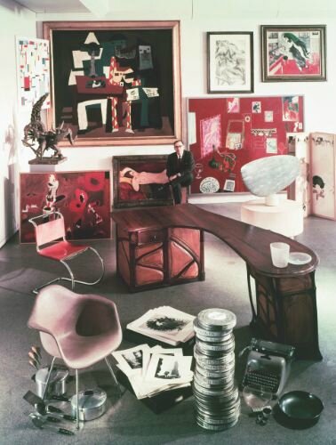
Alfred H. Barr, Jr. poses for a portrait surrounded by paintings and sculptures he collected for the museum, circa 1950. Photo by Arnold Newman/Getty Images
It is clear from well-archived correspondence between the two figures that this striking gift was one that was long considered, investing the present work with even greater narrative resonance. As early as before 1940, Calder repeatedly expressed to Barr his wish to present one of his works to his friend; in the final post-script to one long letter dated March 31, 1938, Calder wrote: “I have decided that you must have one of my objects, even if I have to lend, give or force it, to, or on, you.” It was not until 1966, however, that Barr accepted a gift from the artist, likely coinciding with a subsequent letter Calder wrote to Barr that year: “ ‘I have long felt that whatever my success has been, [it was] greatly as a result of the show I had at MOMA in 1943, and now, as I seem to have quite a number of I think important objects ‘left over’ I would like to make a gift of several of them to the Museum—if you would be interested’… The response to Calder’s letter of 1966 was immediate. Mr. Barr and Dorothy Miller went to Roxbury, Connecticut to see Calder’s two studios and the meadow full of large sculptures. Although uncertain of what Calder would concede from their list of thirteen selections, large and small, they were told: ‘Oh, you can have them all.’” (Harriet Schoenholz Bee, Ed., Art in Our Time: A Chronicle of the Museum of Modern Art, New York, 2004, p. 136) This major gift to the museum in the same year of 1966 included what are widely considered some of Calder’s greatest masterpieces in the collection: Josephine Baker (III) (c. 1927), Snow Flurry, I (1948), Morning Star (1943), Gibraltar (1936), and Spider (1939). It was alongside this endowment of treasures to the world’s greatest museum of twentieth-century art that Calder gave Barr his own treasure: the scintillating glass and wire mobile Untitled, of 1942. This gift, moreover, held particular value, as it was executed just before the seminal MoMA retrospective that catalyzed Calder’s career and inspired the overall bequest to the museum.

Letter from Alexander Calder to Alfred H. Barr, Jr., March 31, 1939. Alfred H. Barr, Jr. Papers, The Museum of Modern Art Archives.

Calder’s sketch for the present work, among inventory drawings for Pierre Matisse Gallery, 1942. Calder Foundation, New York / Art Resource, NY © 2016 Calder Foundation, New York / Artists Rights Society (ARS), New York
Untitled embodies Calder’s distinctly Dadaist sensibility of utilizing an assemblage of diverse and unlikely materials to create an uncanny poetry. 1942 was a critical year for Surrealism in New York, with two legendary Surrealist events held in the fall: the exhibition “First Papers of Surrealism,” held at the Whitelaw Reid Mansion on Madison Avenue, and the opening of Peggy Guggenheim’s Art of This Century gallery at 30 West 57th Street. Calder was notably included in both, evidencing the prominent position that concepts of Surrealism held in his universe at that moment. André Breton associated Calder with Surrealism in the winter of 1942, writing “Excluding every anecdotal element, Calder reduces the object to a few simple lines carving out elementary colors. This object, employing only the properties of movement—not represented movement but real movement—is miraculously brought to life in the most concrete shapes and restores to us the evolution of the celestial bodies, the rustling of foliage, the memory of caresses.” (André Breton quoted in Exh. Cat., New York, L&M Arts, Tanguy, Calder: Between Surrealism and Abstraction, 2010, p. 152) 1942 was also the same year that Calder began his famed series of Constellations, many of which are sketched on the same inventory scroll as the present sculpture. In the days before record-keeping photography, Calder drew miniature thumbnail sketches that would serve as visual identifiers of his works. Just as Calder turned to hand-carved wood as medium for his Constellations, a choice driven by the scarcity of metal needed for the war effort, his use of found and recycled bits of glass in Untitled reflect the artist’s war-time mentality.

Alexander Calder in the exhibition “Alexander Calder: Sculptures and Constructions,” The Museum of Modern Art, New York, September 1943 – January 1944. The Museum of Modern Art Archives, New York. Digital Image © The Museum of Modern Art/Licensed by SCALA / Art Resource, NY © 2016 Calder Foundation, New York / Artists Rights Society (ARS), New York
Alexander Calder, Glass Fish, 1955. Calder Foundation, New York / Art Resource, NY © 2016 Calder Foundation, New York / Artists Rights Society (ARS), New York
Glass is among Calder’s rarest forms of material, notably used in his earliest sculptures such as his much esteemed group ofFish. As the artist recalled to Katharine Kuh in an interview in 1960, he smashed troves of collected colored glass against the stone wall of his barn, but used it only in a limited group of early works. Daniel Marchesseau described the formative influence of these earliest glass mobiles, particularly citing the present work: “They are translucent, gleaming or opaque, and Calder arranged them as would a mosaicist, in a knowingly contrived disorder… the restless, poetic inspiration with which these assemblages are imbued has its root in certain of the mobiles that had been designed beginning in 1936 for Pierre Matisse, Alfred Barr, Mary Reynolds, and Peggy Guggenheim.” (Daniel Marchesseau in Exh. Cat., Paris, Musée des arts décoratifs (and travelling), The Intimate World of Alexander Calder, 1989, p. 237) The architectural design of Untitled fully inhabits Calder’s unparalleled creative genius in its sumptuous choreography of exquisite light, movement, and flawlessly balanced form.
o Coming to Sotheby’s from the esteemed collection of the Morton G. Neumann family, Alberto Burri’s Sacco sold for $7,306,000 (est. $6/8 million) following the record set at Sotheby’s London in February.
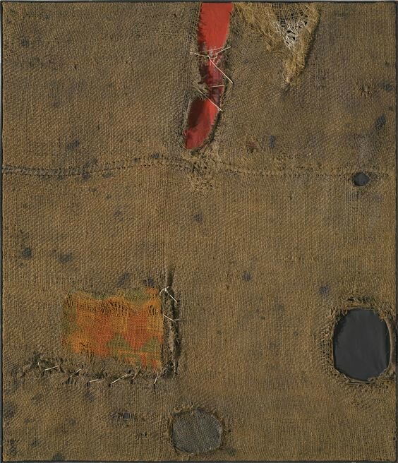
Lot 10. Alberto Burri (1915 - 1995), Sacco, signed on the reverse, oil and burlap on canvas, 39 3/4 by 34 1/4 in. 100.9 by 87 cm. Executed in 1954. Estimate 6,000,000 — 8,000,000 USD. Lot sold 7,306,000 USD to a private American. Photo: Sotheby's.
Provenance: Martha Jackson Gallery, New York
Morton G. Neumann, Chicago (acquired from the above in 1957)
Thence by descent to the present owner
Exhibited: Washington, D.C., National Gallery of Art; and Chicago, Art Institute of Chicago, The Morton G. Neumann Family Collection, August 1980 - April 1981 (Chicago only)
Washington, D.C., National Gallery of Art, Twentieth-Century Art: Selections for the Tenth Anniversary of the East Building, December 1988 - December 1990 (as Red Accent)
Literature: Cesare Brandi, Burri, Rome, 1963, p. 201, no. 169, illustrated (incorrectly dated 1955) (in incorrect orientation)
Edward M. Gomez, "Getting Your Motor Revved Up," ARTnews, Vol. 88, No. 5, May 1989, p. 48, illustrated in color (in installation at the National Gallery of Art, Washington, D.C., 1989)
Fondazione Palazzo Albizzini, Ed., Burri, Contributi al catalogo sistematico, Città di Castello, 1990, p. 61, no. 220, illustrated in color (in incorrect orientation)
Giuliano Serafini, Burri: la misura e il fenomeno, Milan, 1999, p. 75, no. 76, illustrated in color (in incorrect orientation) and p. 40 (text)
Venanzio Nocchi, Estetica e ontologia in Alberto Burri, Città di Castello, 2006, p. 78, no. 2, illustrated in color
Ines Bertolini, Arteficio: Il Riciclo a Regola d'Arte, Trieste, 2007, p. 9, illustrated in color
Bruno Corà, Ed., Burri: Catalogo generale, Pittura 1945-1957, Tomo I, Fondazione Palazzo Albizzini, Città di Castello, 2015, p. 190, no. 445, illustrated in color
Bruno Corà, Ed., Burri: Catalogo generale, Pittura 1945-1957, Tomo VI, Fondazione Palazzo Albizzini, Città di Castello, 2015, p. 87, no. i.5411, illustrated in color
Notes: Sacco exemplifies the meditative power and quasi-religious force that exudes from Burri’s praxis; it is as striking in its compositional simplicity as it is captivating in the minute exactitude of its detail. Color, form, medium, and content entwine and enmesh across the canvas as deep black and hot red galvanize the coarse ochre of burlap. It is neither painting nor sculpture, neither abstract nor figurative, and seems at once elegiac and hysterical; fervent and demure. Sacco is extremely rare and impressive in scale, punctuated with delicate stitching and suffused with a sense of destruction and repair that was entirely fitting for the Italian post-war mood. Moreover, having resided in the highly esteemed Morton G. Neumann family collection for nearly 60 years, its appearance at auction marks an historic event.

Alberto Burri. Photo: Ugo Mulas, © Ugo Mulas Heirs. All Rights Reserved
Mainly created between 1950 and 1956, the Sacchi are Burri’s most celebrated works. They are identifiable by their distinctive use of burlap sacking and prized, not only for their scarcity but also for their rough tactile beauty and coarse conceptual impetus. Burlap was a material of tremendous importance for Burri. It had been ubiquitous during the Second World War, deployed in tents, supply sacks and sandbags, even woven in strips through camouflage netting. The artist’s earliest works even used stretched burlap as a support – an abrasive alternative for conventional canvas. However, in the present work, the burlap becomes more than just a medium. It is the subject matter; a motif that is charged with the significance of that tumultuous conflict that still dominated the European collective memory in the 1950s.

Robert Rauschenberg, Bed, 1955. The Museum of Modern Art, New York, NY, U.S.A. Digital Image © The Museum of Modern Art/Licensed by SCALA / Art Resource, NY Art © Robert Rauschenberg Foundation / Licensed by VAGA, New York
Burri had spent most of the Second World War in America, having been captured and imprisoned by Allied troops. Thus it wasn’t until he returned to Naples in 1946 that he witnessed the aftermath of the conflict upon Italy. He saw gutted apartment blocks, charred black with smoke, and Renaissance churches, stripped of their facades and reduced to rubble. Burri’s brother had been killed, thousands of others were homeless or starving, and it seemed that everything he had previously held dear had been destroyed. He was a surgeon before the war, and a military doctor before he was captured, but to pick up where he left off as if nothing had changed seemed barbaric and reprehensible, even sacrilegious. He turned instead to art; what had started as a prison hobby now became a calling, even an obsession. For the rest of his life, Burri immersed himself completely in the creation of extraordinarily powerful abstract paintings. They were the only means by which he was able to comprehend the horrific trauma that had been inflicted upon his life, his family, and the society in which he lived.
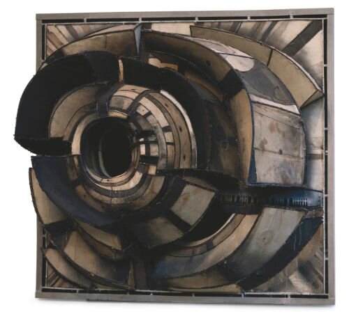
Lee Bontecou, Untitled, 1962. Museum of Fine Arts, Houston, Texas / Bridgeman Images © 2016 Lee Bontecou
The burlap used to create the present work is vitally and indelibly imbued with the turmoil of its historic moment. The present work is pock-marked and strained, patched with an accent of patterned cloth, and strewn with striations of haphazard stitching. Between the flat painted ground, and the expanses of pre-fabricated medium, these stitches are the only trace of artistic gesture in the entire composition. Stretched in taught zig-zags between the unravelling cloth, they carry more import than mere reparative haberdashery and instead bespeak the heartfelt effort of the artist; Burri glorified this passage of ruined fabric, so inexpensive and so inherently damaged that it might easily have been discarded. He emphasized and lionized its repair and, in the context of post-war Italy desperately trying to repair its myriad of socio-economic wounds, this is a statement of overwhelming poignancy. James Johnson Sweeney, the legendary MoMA curator and a close friend to Burri, equated this artistic tenderness to the artist’s medical background: “Burri transforms rags into a metaphor for bleeding human flesh, breathes life into the inanimate materials which he employs, making them live and bleed; then heals the wounds with the same evocative ability and the same sensibility with which he first inflicted them... The picture is human flesh, the artist a surgeon.” (James Johnson Sweeney quoted in Exh. Cat., Rome, L’Obelisco, Burri, 1955, n.p.)

Lucio Fontana, Concetto Spaziale, La Fine di Dio, 1963 © 2016 Lucio Fontana / Artists Rights Society (ARS), New York / SIAE, Rome
For more than half a century since its creation, Sacco has resided in the highly esteemed Morton G. Neumann Family collection and is thus identifiable as a masterpiece of rare quality. Neumann was an industrialist from Chicago who began to acquire art with his wife in the late 1940s. Although they were entirely self-taught in connoisseurship, their collection is unrivalled in depth and quality, elucidating masterpieces from some of the greatest artists of the Twentieth Century. The Neumann’s decisions in acquisition were informed by the great dealers of the age – Pierre Matisse, Daniel-Henry Kahnweiler, and Sidney Janis – and their frequent travels through Europe afforded them personal relationships with Fernand Léger, Man Ray, Pablo Picasso, Joan Miró, Jean Dubuffet, and Alberto Giacometti. In 1980, they were honored by a major exhibition presented by the Art Institute of Chicago, at which the present work was exhibited; a tribute to the institutional quality and range of their extraordinary assemblage. Neumann acquired Sacco in the years immediately following its creation, exemplifying that judgement made of him by the art historian Sam Hunter: “For Neumann, art collecting is a profound form of personal commitment – a consuming passion and an obsession. He rarely waits for the seal of approval to descend on the artist or product and clearly prefers to move as close as he can to the crucible of emerging talent." (Exh. Cat., Washington, D.C., National Gallery of Art, The Morton G. Neumann Family Collection, 1980, p. 15).

Alberto Burri, Sacco e Rosso, 1954, Tate Collection, London. Image: © Tate, London, 2016. © 2016/ Artists Rights Society (ARS), New York / SIAE, Rome.

Alberto Burri, Sacco e Rosso, c. 1959. Private Collection, Sold Sotheby’s London, February 2016 ($13.2 million, World Auction Record for the Artist) © 2016/ Artists Rights Society (ARS), New York / SIAE, Rome
Sacco is as avant-garde as it is elegiac, as engaging in concept as it is evocative in content. In each single stitch of the composition, Burri beseeches his viewer’s empathy and mourns the losses inflicted not only upon his own life, but on Europe as a whole. It stands as an emblem for the European post-war mood; scorched by charred soot-black, seeping from a wound of hot scarlet red, battered but unbowed, hanging on by mere stitches of thread.
o Sold by the Irma and Norman Braman Art Foundation, David Smith’s Zig I, a wonderful example from the artist’s mature period, fetched $9,210,000 (est. $8/12 million).

Lot 28. David Smith (1906 - 1965), Zig I, inscribed with the artist's signature, titled and dated 4-15-1961 on the lowest horizontal plane, painted steel, 96 1/2 by 57 by 32 1/4 in. 245.1 by 144.8 by 81.9 cm. Estimate 8,000,000 — 12,000,000 USD. Lot sold 9,210,000 USD to an Anonymous. Photo Sotheby's.
Provenance: Estate of the Artist
Marlborough-Gerson Gallery, New York
Catherine Schlumberger Jones, Washington, D.C.
Sotheby's, New York, November 6, 1990, Lot 12 (consigned by the estate of the above)
Acquired from the above by the present owner
Exhibited: Pittsburgh, Carnegie Institute, The Pittsburgh International Exhibition of Contemporary Painting and Sculpture, October 1961 - January 1962, no. 521
Chicago, Art Institute of Chicago, Sculpture: A Generation of Innovation, June - August 1967
Washington, D.C., National Gallery of Art, David Smith: Seven Major Themes, November 1982 - April 1983, p. 110, illustrated and illustrated (detail) and pp. 109 and 111 (text)
Valencià, IVAM, Centre Julio González; and Madrid, Museo Nacional Centro de Arte Reina Sofía, David Smith: 1906-1965, January - July 1996, p. 229, illustrated (detail)
North Miami, Museum of Contemporary Art, David Smith: Stop Action, December 1998 - February 1999, no. 8 (checklist)
Tel Aviv, Tel Aviv Museum of Art, David Smith: Paintings, Sculptures, and Medals, November 1999 - February 2000, p. 66, no. 41, illustrated
Gainesville, Florida, Samuel P. Harn Museum of Art, Extended Loan, 2012 - March 2016
Literature: Ralph Brem, "$1000 Prize Refused: Fourth of 'Zig Field' Center of Art Hassle," Pittsburgh Press, October 31, 1961, p. 28 (text)
"Sculptor Rejects Award of $1,000," New York Times, November 1, 1961 (text)
Mel Gonick, "Area Artist Returns $1,000 So Museum May Buy Art," Troy Record, November 2, 1961, n.p. (text)
Exh. Cat., Cambridge, Massachusetts, Fogg Art Museum, Harvard University (and travelling), David Smith: 1906-1965, 1966, p. 79, no. 424 (checklist)
Exh. Cat., New York, Solomon R. Guggenheim Museum, David Smith, 1969, p. 125 (text)
Rosalind E. Krauss, Terminal Iron Works: The Sculpture of David Smith, Cambridge, Massachusetts, 1971, p. 9, fig. 3a, illustrated (in the artist's Bolton Landing workshop)
Rosalind E. Krauss, The Sculpture of David Smith: A Catalogue Raisonné, New York and London, 1977, fig. 531, illustrated and p. 97 (text)
Exh. Cat., Washington, D.C., Smithsonian Institution, From The Life of the Artist: A Documentary View of David Smith. An Exhibition Drawn from the David Smith Papers, 1982, p. 55, illustrated (at Bolton Landing)
Exh. Cat., Washington, D.C., Hirshhorn Museum and Sculpture Garden, David Smith: Painter, Sculptor, Draftsman, 1982, p. 17 (text)
Phyllis Tuchman, "In Detail: David Smith and Cubi XXVIII," Portfolio, Vol. 5, January - February 1983, p. 81 (text)
Stanley E. Marcus, David Smith: The Sculptor and His Work, 1983, p. 135, fig. 52 (reproduction of 1961 New York Times article)
Exh. Cat., Leeds, Henry Moore Centre, Leeds City Art Galleries, David Smith: Medals For Dishonor 1937-1940, 1991, p. 17 (text)
Deborah K. Dietsch, "Geometry in Motion," Sun-Sentinel, Tampa, Florida, January 3, 1999, n.p., illustrated (online resource)
Exh. Cat., New York, Gagosian Gallery, Group Sculpture Show, 1999, p. 2 (text)
Elisa Turner, "David Smith," Art News, V. 98, No. 6, June 1999, p. 133, illustrated in color
Angela Levine, "The Anvil of Smith," Jerusalem Post, December 10, 1999, p. B14 (text)
Exh. Cat., Los Angeles, Los Angeles County Museum of Art, David Smith: Cubes and Anarchy, 2011, p. 104, fig. 10, illustrated (in progress in the artist’s Bolton Landing workshop)
Exh. Cat., Washington, D.C., The Phillips Collection, David Smith Invents, 2011, pp. 56-57, illustrated (in installation at Bolton Landing)

Andreas Feininger, David Smith, 1940, Albright-Knox Art Gallery / Art Resource, NY © 2016 Estate of Andreas Feininger
Notes: “I’ve been painting sculpture all my life. As a matter of fact, the reason I became a sculptor is that I was first a painter. “ (interview with Thomas B. Hess printed in Exh. Cat., New York, Marlborough-Gerson Gallery, David Smith, October 1964)
“Sculpture is a poetic statement of form.” (Cleve Gray, Ed., David Smith by David Smith: Sculpture and Writing, New York, 1968, p. 71)

Zig I in the workshop at Bolton Landing Photo and Art © The Estate of David Smith/Licensed by VAGA, New York, NY
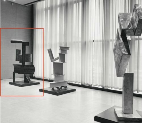
Zig I installed in the exhibition “Sculpture: A Generation of Innovation,” The Art Institute of Chicago, June – August 1967 Art © The Estate of David Smith/Licensed by VAGA, New York, NY

Zig I in the Fields at Bolton Landing Photo and Art © The Estate of David Smith/Licensed by VAGA, New York, NY
Throughout his career, Smith was inspired by the most avant-garde artistic innovations – including Cubism, Constructivism, and Expressionism – to create innovative sculptural forms, which combined aesthetic daring with impressive technical skill in a variety of sculptural materials. By the 1960s, Smith arrived at a transcendent synthesis of this broad range of influences, and the Zig series, along with the contemporaneous Cubi series, embody the eloquent sophistication and erudite refinement achieved by Smith at this mature stage of his career. With particular allusions to Cubism, Smith’s geometric forms are balanced and juxtaposed with assurance, and they ultimately surpass the earlier masters of Cubist form such as Picasso, through a unified structural elegance that introduced a more open and fluid interplay between volume and line as well as positive and negative space. Named for the ancient terraced pyramidal form of a ziggurat, the Zigs exhibit a monumental presence consisting of tiered combinations of convex and concave forms derived from sections of tubular cylinders. The greatness of Zig I is most fully appreciated in the round, as the viewer circumnavigates around the work. The sinuous curves alternate in a myriad of vertical and horizontal juxtapositions with one another, as we fully experience the complexity of Smith’s compositional vigor.
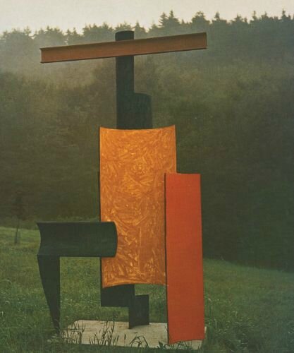
Zig II, 1961, Des Moines Art Center Permanent Collections. Gift of the Gardner Cowles Foundation in memory of Mrs. Florence Call Cowles (1972.89) Art © The Estate of David Smith/Licensed by VAGA, New York, NY
Throughout his career, Smith was inspired by the most avant-garde artistic innovations – including Cubism, Constructivism, and Expressionism – to create innovative sculptural forms, which combined aesthetic daring with impressive technical skill in a variety of sculptural materials. By the 1960s, Smith arrived at a transcendent synthesis of this broad range of influences, and the Zig series, along with the contemporaneous Cubi series, embody the eloquent sophistication and erudite refinement achieved by Smith at this mature stage of his career. With particular allusions to Cubism, Smith’s geometric forms are balanced and juxtaposed with assurance, and they ultimately surpass the earlier masters of Cubist form such as Picasso, through a unified structural elegance that introduced a more open and fluid interplay between volume and line as well as positive and negative space. Named for the ancient terraced pyramidal form of a ziggurat, the Zigs exhibit a monumental presence consisting of tiered combinations of convex and concave forms derived from sections of tubular cylinders. The greatness of Zig I is most fully appreciated in the round, as the viewer circumnavigates around the work. The sinuous curves alternate in a myriad of vertical and horizontal juxtapositions with one another, as we fully experience the complexity of Smith’s compositional vigor.

Zig III, 1961. Private collection, courtesy Estate of David Smith, New York Art © The Estate of David Smith/Licensed by VAGA, New York, NY
Beginning with his Agricola series in the early 1950s, Smith’s oeuvre evolved in groups of thematic forms, each series acting as both an organizational and inspirational focus for Smith; each group of works developed its own vocabulary of aesthetic relationships and principles which grew out of previous sculptures and informed the creation of simultaneous series as well as sculptures to come. The first five sculptures of the series, Zig I, Zig II, Zig III, Zig IV and Zig V, all from 1961, premiered at the 1961-1962 Pittsburgh International Exhibition of Contemporary Painting and Sculpture at the Carnegie Institute, where Smith was awarded third prize. The Zig series had been identified as an eight sculpture series by Rosalind E. Krauss in her 1977 catalogue raisonné, but only seven sculptures were inscribed with this title by the artist. An eighth work from 1964 was posthumously postulated as Untitled (VI) by E. A. Carmean when Zig I joined all the Zigs except Zig IV in his David Smith exhibition at the National Gallery of Art in Washington, D. C. in 1983. This “Seven Major Themes” exhibition was conceived by Carmean, the Curator of Twentieth Century Art, to highlight the critical role that serial conception and execution played within Smith’s inventive oeuvre, and to celebrate the Agricolas, Sentinels, Zigs, Circles, Voltri-Boltons, Wagons and Cubisseries.
Zig IV, 1961, Lincoln Center for the Performing Arts, New York, gift of Mr. and Mrs. Howard Lipman Art © The Estate of David Smith/Licensed by VAGA, New York, NY
Concurrently filling his studio and creative imagination in the 1960s, Zigs and Cubis share a thematic purity among David Smith’s series and oeuvre. The titles and the compositions are devoid of a single literally rendered figurative motif such as in the Agricolas or Sentinels, and their steel material has no romantic allusions to previous functions or histories that the industrial and farm detritus bring to the Agricolas and Voltris. In his chapter devoted to the Zigs, E. A. Carmean linked theZigs to the Cubis, describing both as “being made up of elements that have no clear identity beyond that of being essential geometric shapes.” (Exh. Cat., Washington, D. C., National Gallery of Art, David Smith: Seven Major Themes, 1982, p. 108) The main attributes of the Zigs and Cubis – their monumental scale, the use of reflected or applied color, and the shared characteristics of shape – align the two series together as the primary innovative works of the artist’s last years. Begun in the same year of 1961, they can be seen as an artistic dialogue, interplaying with one another and leaving tantalizing hints, at the time of his untimely death in 1965, of the direction either series might have led Smith in his celebration of sculptural form, geometry, mass, space and color. As the artist eloquently stated, “When I begin a sculpture I am not always sure how it is going to end. In a way it has a relationship to the work before, it is in continuity to the previous work – it often holds promise or a gesture towards the one to follow.” (Cleve Gray, Ed., David Smith by David Smith: Sculpture and Writing, New York, 1968, p. 56)
Zig V, 1961, Fine Arts Museums of San Francisco. Museum purchase, gift of Mrs. Paul L. Wattis Art © The Estate of David Smith/Licensed by VAGA, New York, NY
Smith acknowledged one particular pedestal-scale sculpture, Bouquet of Concaves (1959, Phillips Collection, Washington, D., C.) as a direct inspiration for the curved steel plate constructions in the more monumental series of Zigs. “My thoughts saw concave and convex – and the sculpture I recently finished called Bouquet of Concaves, and immediately my vision grew to concaves larger than my own being, …This was a flash of recognition. ….[I] appreciatively recalled Léger in 1913 like the pictures of so called Tubism in the Arensberg Collection in Philadelphia.” (Ibid., p. 114) Unlike the more three-dimensional units of shape in the Cubi series, Zig I and its sister sculptures are composed of more two-dimensional plates of steel, but Smith’s three tiers of horizontal curved sections arrayed around a strong vertical centralized spine succeed in achieving a palpable sense of volumetric shape in Zig I. This commanding presence that inhabits the viewer’s space is emphasized by the other critical characteristic of the Zigs and Cubis, mainly Smith’s surface treatment as a compositional component.

Untitled (Zig VI), 1964, Tate Modern, London (on extended loan from the Estate of David Smith, New York) Art © The Estate of David Smith/Licensed by VAGA, New York, NY
By the 1960s, Smith reveled in the use of polished stainless steel, exhibited outdoors in the Bolton Landing fields not only for the white reflective sunlight effects that dazzle the eye, but also for the reflection produced by the myriad colors of the landscape. The bright blues of the sky, the deep greens of the woods, and often the white snow blanketing Bolton Landing’s hills – all of these were as much of an expressionistic surface “palette” as the enamel painted surface of the Zigs and Circlesseries. As Smith commented in regard to the Cubis, “[They] take on the dull blue, or the color of the sky in the late afternoon sun, the glow, golden like the rays, the colors of nature. And in a particular sense, I have used atmosphere in a reflective way on the surfaces. They are colored by the sky and the surroundings.” (interview with Thomas B. Hess printed in Exh. Cat., New York, Marlborough-Gerson Gallery, David Smith, October 1964)
Zig VII, 1963, Museum of Modern Art, New York. Mrs. Simon Guggenheim Fund (by exchange) and gift of Candida and Rebecca Smith Art © The Estate of David Smith/Licensed by VAGA, New York, NY
In an earlier 1961 interview, the same year of Zig I, Smith discussed his painted sculptures, “I belong with painters, in a sense; … Some of the greatest departures in the concept of sculpture have been made by Picasso and Matisse… Painting and sculpture are not very far apart. I painted for some years. I’ve never given it up.” (BBC radio interview with David Sylvester, June 6, 1961, published in Living Arts, Vol. 1, No. 3, April 1964) While Smith also employed painterly surfaces in other series such as the Tanktotems and Circles, several of the Zigs, and most notably Zig I, echo the swirling patterns in the polished stainless steel of the Cubis in the looping, gestural and scumbled application of the enamel paint. In both series, Smith invited a close union between surface and dimensional composition, activating the surfaces through either the colors of the brush or the colors of the landscape.

Zig VIII, 1964, Museum of Fine Arts, Boston, Centennial Purchase Fund Art © The Estate of David Smith/Licensed by VAGA, New York, NY
Smith began his artistic career as a painter, and continued to draw and paint on paper and canvas throughout his life, often employing his sculptural forms as motifs. In discussing his transition from canvas to sculpture, Smith cited the iron constructions of Picasso and Julio González from 1931 as the “liberating factor”, and acknowledged the evolution of dimensionality that overtook his creative output. “After my student period in painting, ….my painting had turned to constructions which had risen from the canvas so high that a base was required where the canvas should be, I was now a sculptor.” (Cleve Gray, Ed., David Smith by David Smith: Sculpture and Writing, New York, 1968, p. 68) At the time that Zigs I-V were on display at the Carnegie in Pittsburgh, several reviewers noted the new sophistication and refinement in Smith’s compositional geometries, and noted in particular the successful use of color as an important quality to Smith’s work during this period when his creative powers were at their height. Irving Sandler noted, “Color now provides a lyrical balance, softening the strict forms cut from massive steel sheets up to an inch thick – even threatening to dissolve them. …the masterful way in which Smith fuses these disparate plastic elements into organic wholes generates the drama in his sculptures.” (Irving Sandler, “In the Art Galleries,” New York Post Magazine, October 22, 1961, p. 12) And the Zig series and the use of color were even more eloquently celebrated by Brian Doherty: “Brightly colored, remarkably inventive, thoroughly transforming their compositions, they command attention like signposts,… Color is rarely used with any success in sculpture. …But Mr. Smith’s colors initiate a lively dialogue with the forms about them. They control, amplify and modify surfaces, like the color in precise abstract painting. The whole effect is to create sculpture that is lively and profound without being solemn." (Brian O’Doherty, “Art: Still-Lifes and New Sculpture,” New York Times, October 11, 1961, p. 44).
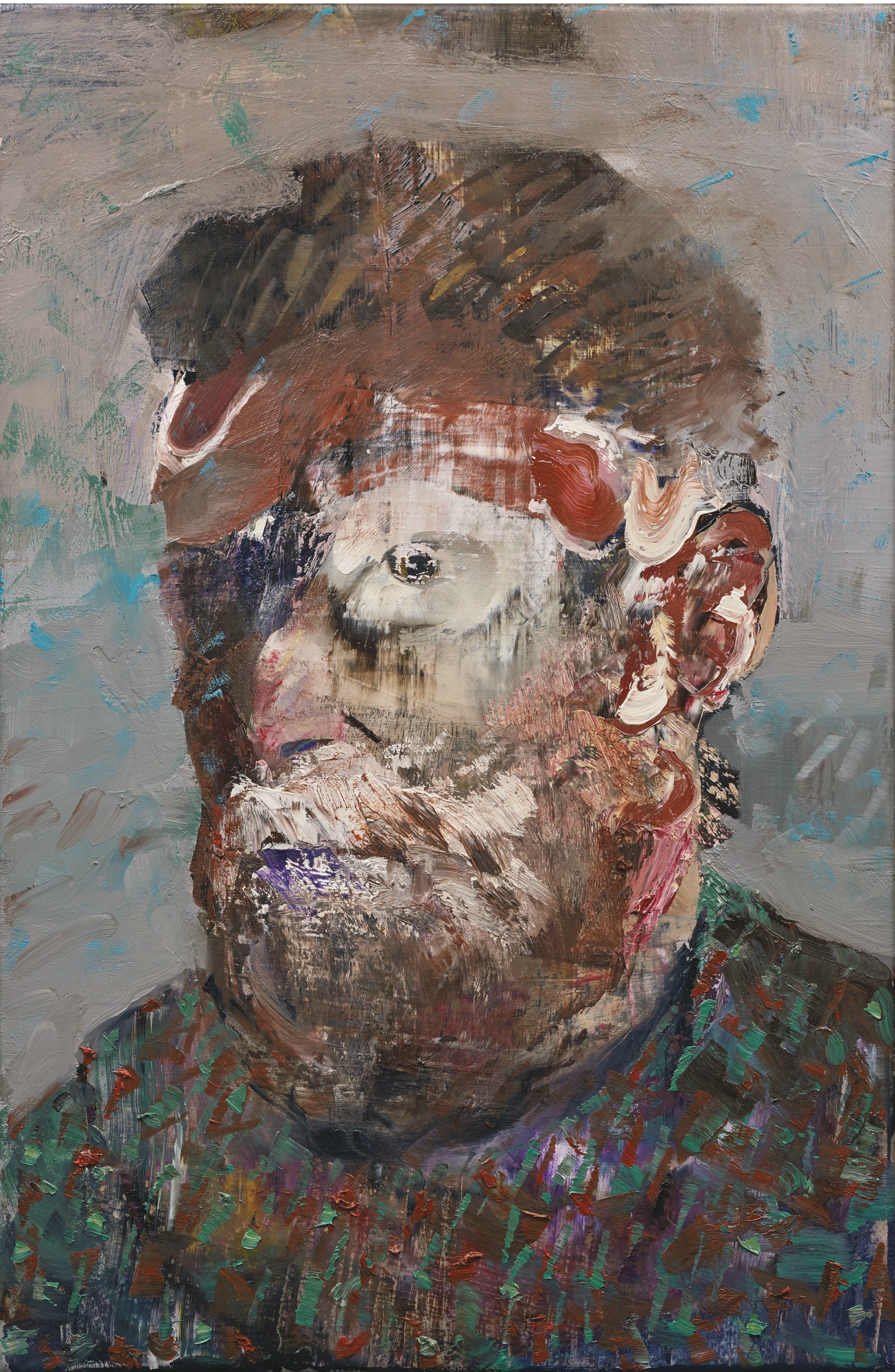
Lot 1. Adrian Ghenie (B. 1977), Self Portrait as Vincent Van Gogh, signed and dated 2012 on the reverse, oil on canvas, 19 by 12 in. 48.3 by 30.5 cm. Estimate 200,000 — 300,000 USD. Lot sold 2,590,000 USD to Mr. Yusaku Maezawa. Photo Sotheby's.
Provenance: Pace Gallery, New York
Acquired from the above by the present owner
Exhibited: New York, Pace Gallery, Adrian Ghenie: New Paintings, March - May 2013, p. 35, illustrated in color
Venice, 56th Biennale di Venezia: Romanian Pavilion, Adrian Ghenie: Darwin's Room, May - November 2015, p. 53, illustrated in color and p. 79, illustrated in color (in installation)
Literature: Juerg Judin, Ed., Adrian Ghenie, 2013, p. 97, illustrated in color
Exh. Cat., Venice, La Biennale di Venezia 56. Esposizione Internazionale d'Arte: All the World's Futures, Vol. 2, 2015, n.p. (checklist)
Notes: From the influential (Charles Darwin, Vincent van Gogh and Marcel Duchamp) through to the notorious (Hitler, Lenin and Stalin), and the popular (Elvis, Stan Laurel and Oliver Hardy), Adrian Ghenie has painted both the famous and infamous. Among these however, there are only two with whom he personally identifies: of Ghenie’s titled self-portraits, the most remarkable are those belonging to a small group of recent self-images centered on the effigies of Darwin and Van Gogh. Indeed, in many ways these two historical figures form the structural pillars of Ghenie’s recent work. Based on one of the very last self-portraits by the Dutch Post-Impressionist (Musée d’Orsay, Paris), Self Portrait as Vincent van Gogh is an extraordinary composite of the historical and the personal. In layers that are pastose and wonderfully variegated, this painting embodies a painterly palimpsest of masked and spliced identity and identification. Into this work Ghenie poured his childhood adulation for the post-impressionist master and, through it, he has addressed the nefarious implications of Charles Darwin’s theory of biological evolutionism. In 2015, Ghenie succinctly tackled this key dialogue for his acclaimed exhibition at the 56th Venice Biennale. Entitled Darwin’s Room and shown in the Romanian Pavilion as it would have appeared in 1938, this show explored the repercussions of Darwin’s revolutionary discoveries, following the darker implications of ‘survival of the fittest’ through to some troubling conclusions. Among the paintings of Darwin, Hitler, and images invoking the infamous Nazi book burnings and Degenerate Art Exhibition of 1937, Self Portrait as Vincent van Gogh formed a crucial part of this landmark show. Furthermore, acting as a pendent piece to Ghenie’s extraordinary The Sunflowers in 1937, and as the first from a series of three works after Van Gogh’s own painted likeness, the present work is truly emblematic of Ghenie’s challenging revival of both history painting and self-portraiture.
At its core this painting is a dual image: both a re-presentation of history and a reflection of Ghenie’s own sense of self. As a youth the artist was captivated by Van Gogh’s iconic Sunflowers and fascinated by the story of a great artist and his affliction with mental illness. Indeed, his own relationship with the present work’s source dates back to childhood memories of a magazine article entitled ‘The Tragic Life of Vincent van Gogh’. The lack of art books in the Ghenie household meant that this magazine would stay with the artist for years; on the front was an off-color image of Van Gogh’s Sunflowers, while the article itself illustrated a black and white image of the Musée d’Orsay self-portrait. In 1998, when visiting this museum for the first time, Ghenie’s encounter with this painting affected him deeply. Finding himself unexpectedly under the scrutiny of Van Gogh’s penetrating stare, Ghenie’s uneasiness descended into a fit of nausea. So strong and violent was his reaction that it echoed quite spectacularly a memorable scene in the 1967 film The Night of the Generals. In this film a Nazi officer played by Peter O’Toole inspects a warehouse full of looted and confiscated fin de siècle masterpieces; when passing in front of the very same d’Orsay self-portrait and its piercing gaze O’Toole’s character is reduced to a panicking wreck. Seen only by Ghenie after his museum visit in 1998, this film not only anticipated his own experience of Vincent’s eyes, but also the lens through which Van Gogh would come to be scrutinised in Ghenie’s own artistic production.
The purging of ‘degenerate art’ – a term used by the Nazi party to refer to any artwork deemed harmful to German sentiment – formed a key cultural policy of National Socialism and has proved a powerful subject in Ghenie’s recent work. Its aim to cleanse Germany from a culture of ‘degeneracy’ resulted in seizing thousands of artworks from public institutions and collections across Germany and Nazi occupied Europe. Comprising works by Chagall, Kandinsky, Munch, Picasso, and Van Gogh among many others, a selection of these works were famously shown together in 1937 as part of the Entartete Kunstexhibition in Munich, while the majority were sold, traded, or destroyed. In addition to the 1937 exhibition, Hitler’s final list of ‘Entartete Kunst’ comprised an inventory of more than 16,000 pieces including a Van Gogh self-portrait from the Bayerische Staatsgemäldesammlungenin in Munich; shortly after the list was compiled this painting was auctioned off at Galerie Fischer in Lucerne for 175,000 Swiss Francs. Casting a devastating blow to cultural achievement, this campaign was borne of the Third Reich’s harrowing eugenics policy, a policy firmly rooted in Charles Darwin’s On the Origin of Species (1859).
Darwinism not only changed the face of the natural sciences, it revolutionized the way we view our place in the world; in one fell swoop it liberated humanity from the feudal strictures of a perceived social and natural order. However, and this is where Adrian Ghenie’s interest comes into play, its effect wasn’t entirely positive: the pioneering work on genetic science that developed in Darwin’s wake unleashed the ugly off-shoot of Darwinian thought that is Eugenics. Alongside the sterilization and euthanasia projects, the concentration camps and their gas chambers, the purging of ‘degenerate’ culture formed part of National Socialist Party’s endeavour to eliminate ‘life unworthy of life’ in the construction of a master race. With his over-painted piercing stare and possessing a visceral texture that appears to pulsate with life, Self-Portrait as Vincent van Gogh is at once a victim and purveyor of this dark passage in twentieth-century history.

Lot 14. Christopher Wool (B. 1955), Untitled, signed, titled, dated 1990 and inscribed P119 on the reverse, enamel and acrylic on aluminum, 96 by 64 in. 243.8 by 162.6 cm. Estimate 14,000,000 — 18,000,000 USD. Lot sold 13,914,000 USD to Mr. Yusaku Maezawa. Photo Sotheby's.
Provenance: Luhring Augustine Gallery, New York
Private Collection, Europe
Private Collection, New York
Exhibited: Rotterdam, Museum Boymans-van Beuningen; Cologne, Kunstverein Köln; and Bern, Kunsthalle Bern, Cats in Bag, Bags in River. Christopher Wool, Vol. 1, February - August 1991, n.p., no. 20, illustrated and illustrated (detail)
Ludwigshafen am Rhein, Wilhelm-Hack-Museum, Zeitsprünge. Künstlerische Positionen der 80er Jahre, January - February 1993, p. 91, illustrated
Hamburg, Hamburger Kunsthalle, Extended Loan, 1997 - 2013
Hamburg, Hamburger Kunsthalle; and Stuttgart, Staatsgalerie, Heißkalt (Ice Hot), November 2003 - February 2004, p. 100 (text)
Hamburg, Hamburger Kunsthalle, 15 Jahre Galerie der Gegenwart, September 2012 - October 2013
Stuttgart, Kunstmuseum Stuttgart, Cool Place, July - November 2014
Literature: Uwe M. Schneede, Family Values: American Art in the Eighties and Nineties, Hamburger Kunsthalle, Hamburg, 1996, p. 95, illustrated
Uwe M. Schneede, Ed., Hamburger Kunsthalle, Contemporary Art Wing, New York, 1997, p. 77, illustrated
Anna María Guasch, Los manifiestos del arte posmoderno, Madrid, 2000, p. 197, no. 26, illustrated
Notes: “Wool’s litany of nine-letter nouns describing social types compressed to a single characteristic may be seen as a series of self-portraits, or they may refer to the paintings themselves; or perhaps they mirror their viewer’s state of mind. Whatever the case may be, they are loud attempts at definition, even as the self in question is irretrievable for being subsumed under clichés. Ultimately the resolution of their disputed identities rests squarely with the spectator, for words, like artworks, are not autonomous, but subject to and shot through with the memories, associations, and preconceptions brought to bear by each viewer.” (Exh. Cat., Los Angeles, The Museum of Contemporary Art (and travelling), Christopher Wool, 1998, p. 268)
Nine years before Christopher Wool stenciled the word “CHAMELEON” in lustrous black enamel letters on a stark aluminum ground painted white, Douglas Crimp announced the long-anticipated death of painting. When painting allegedly reached its final endgame, the remaining survivors were left to adapt amidst a landscape of shifting notions of authorship and originality. With his complex conceptual project, Wool has formed a practice that challenges and subverts these crucial questions of postmodernism to push our understanding of painting into a fundamentally different direction. Like a chameleon, in his practice, Wool constantly deviates from formal boundaries, leveraging the entropy of image-making to deliver a succinct statement on the very anarchy of his painterly enterprise. Concurrently provocative and aesthetically seductive, Christopher Wool’s Untitled is a seminal early example of the artist's most renowned and desirable body of text paintings: the Black Bookseries. Nearly half of the comparable paintings from this eminent series of 9-letter word Black Book paintings belong to prominent museum collections, such as the Museum of Contemporary Art in Los Angeles, the San Francisco Museum of Modern Art, the Baltimore Museum of Art, and the Broad Art Museum in Los Angeles. Exceptional among the group for the unique complexity of the word it depicts, this extraordinary painting is further distinguished by its long-term temporary loan to the Hamburger Kunsthalle for 16 years, from 1997 – 2013.
The present work can perhaps be considered the face of Wool’s Black Book paintings; originated as a series of small-scale works on paper, these paintings were created over a two-year period at the dawn of the artist’s career. The very word “CHAMELEON” represents a sense of ease in shifting amongst a cast of various guises: the unique capacity to morph into any one of the character types Wool introduced in the series. Intrigued by the 1950 collection of short stories by Raymond Chandler titled Trouble is My Business, Wool absorbed Chandler’s literary vision of a seedy city populated by corrupt characters. In response, Wool invented a company of these pathological types in what became his Black Book. Katherine Brinson explains, “Suggestive of a shadowy regime in which hypocrisy and betrayal are the only viable options for survival, the Black Book drawings have been read both as accusations directed at the viewer and as a more general indictment of a rotten society. Another possibility is that they represent a self-lacerating catalogue of the various roles an artist might take on, expressing Wool’s vexed relationship to the notion of the masterful figure in the studio.” (Katherine Brinson in Exh. Cat., New York, Solomon R. Guggenheim Museum (and travelling), Christopher Wool, 2013, p. 41) With these multifaceted descriptions of character articulated through aggressively large, imposing stencils, Wool indicts not only the viewer faced with the painting, but also himself—a heightened self-reflexivity that questions the very nature of the artist amidst a discursive context of overwhelming uncertainty toward the status of painting. Jeff Perrone suggests, “These not-so-flattering attributes may be read as self-reflexive. But this emotional self-portraiture only serves to intensify the painter’s anxiety in projecting such image clichés to his audience. The coherence of the analogy between the content and the form it takes, however, produces a tension for any viewer, because the sheer power of address, almost accusatory in tone, asks us to confront our own tendency to reduce others instinctively to a single, blunt trait.” (Jeff Perrone, “In the Shadow of Painting,”Parkett 33, 1992, p. 103)
With the nine-letter word stacked in three rows of three, the word resists instantaneous legibility and instead demands fixed concentration. The anxiety, dread, and paranoia that permeate these pictures summon an intensity and shrill fragility that is visually mirrored in the imperfections that break the rigidity of each stenciled letter: drips, smears, and errors threaten the order of the gridded word, and in every stop we teeter at the ominous brink of total systemic destruction. As is characteristic of Wool’s paintings, the edges of the stenciled blocks reveal small but arresting glitches of process—rich incidents of skipping or distortion that corrupt our reading of the word. The formality of the grid and the truncation of the word imply constriction, while the obstruction of such severe boundaries by painterly interruptions articulate a palpable danger along every edge. As Brinson wrote, “Wool was less concerned with language as a means to transcend image, or with the problematic conjunction of text and image, than with text as image. He had long been fascinated by the way words function when removed from the quiet authority of the page and exposed to the cacophony of the city, whether through the blaring incantations of billboards and commercial signage or the illicit interventions of graffiti artists. But with their velvety white grounds and stylized letters rendered in dense, sign painter’s enamel that pooled and dripped within the stencils, the word paintings have a resolute material presence that transcends the graphic.” (Katherine Brinson in Exh. Cat., New York, Solomon R. Guggenheim Museum (and travelling), Christopher Wool, 2013, p. 40) The painterly composition is minimal and the individual letters have been reduced to a bipolar, stenciled schematic. Whereas the execution of the work achieves the perfection of Minimalist reduction on the one hand, on the other it includes overt suggestion of its handmade manufacture, with the irregular outline, smudges and drips heavily in evidence. Through his text paintings Wool interrogates not only the definitions of subject matter, conceptual content, and creative authorship in painting, but also demonstrably exhibits a love of the act of creation, insistently leaving remnants of the process of its making, such as the luscious drips of ink-like paint in the present work, to designate the hand of the artist.
The oft-recounted story of the moment Christopher Wool was moved to create his first word painting is something close to a New York myth. It’s the kind of account that perfectly conveys the magic of the city: in 1987, while walking the streets of his Lower East Side neighborhood, Wool encountered a graffitied white truck. Scrawled across its side was a tag reading, “SEX LUV” and the artist was so affected by the sight, he returned to his studio to create his own painterly version. This initial rendering of S-E-X and L-U-V laid the groundwork for what would become his signature technique—large black letters, placed vertically over one another and stenciled upon a smooth white background. Wool began this series in 1987 by painting prominent stenciled black capital letters on aluminum surfaces, reveling in their elusive quality and ambiguity. Associated with both the punk poetics of the downtown scene in the early 1990s alongside the increase in postmodern critical thinking, Wool’s paintings investigate the limitations of language as descriptive signifiers, challenging the legibility and objectivity of language by its visual capacity for incessant re-interpretation.
Dating back to the Analytic Cubist paintings of Picasso and Braque before the First World War that incorporated collaged elements of newspaper headlines, typography became an integral part of Futurism, Constructivism and Bauhaus design. During the 1950s, when galleries were dominated by Abstract Expressionism, Jasper Johns used stencils in his work to counter the outpourings of emotion among his fellow painters. Referencing Duchamp and Dada, Johns was interested in stencils because of their ready-made status - when used in paintings, they challenged the authenticity of the personal brushstroke. Even Francis Bacon would come to incorporate Letraset typography in his paintings to address questions of Saussurian semiotics, the dynamics of sign systems, and methods of communication. Furthermore, concrete poetry of the 1960s and early 1970s abandoned grammar, syntax and punctuation to break words into apparently arbitrary units.
Of Wool’s Black Book paintings, Richard Prince wrote: “These are words that I would and I could describe Christopher with. I would if I could but he’s already done it himself.” (Richard Prince in Exh. Cat., New York, Solomon R. Guggenheim Museum (and travelling), Christopher Wool, 2013, p. 236) If Wool’s Black Book paintings are meant to be read as self-portraits, then the present work is indisputably the most accurate of all: capturing Wool’s unparalleled ability throughout his career to challenge and subvert accepted modes of image-making by consistently shifting his practice, all the while maintaining a stark anonymity. Wool’s paintings unravel conceptions of mark-making, obfuscating the perimeters between the hand-made and the machine-made. In this way, Wool’s own subjectivity recedes into the distance—the artist becomes the chameleon after all.
New to the New York Evening Sale:
o Untitled by Günther Förg sold for $670,000 (est. $250/350,000) after bidding from four collectors.

Lot 16. Günther Förg (1952 - 2013), Untitled, signed, dated 1986 and inscribed 212/86 on the reverse, acrylic on lead on wood, 63 by 43 1/2 in. 160 by 110.5 cm. Estimate 250,000 — 350,000 USD. Lot sold 670,000 USD. Photo Sotheby's.
Provenance: Galerie Lelong, Zurich
Private Collection, Germany
Acquired from the above by the present owner
Notes: Displaying an astonishingly sparse embrace of the idiosyncratic visual properties of discerningly selected materials, Günther Förg’s breathtaking Untitled is an exemplary exponent of the artist’s nuanced extension of the modernist tendency, declaring an ultimate aesthetic of purity. Boasting an intense corporeal charisma, this work stands at the apogee of the artist’s most significant body of work – his lead paintings – which call upon the authentic planarity of color field painting whilst establishing an altogether new architectural territory for the medium. Through a strident annunciation of unadulterated pigments and revelry in the unique coarseness of their interaction with unprimed lead, Förg re-oriented the dialogue for minimalist painting and situated himself amongst the most significant artists of the Twentieth Century.
Studying at The Academy of Fine Art Munich from 1973- 76, Förg’s early career was dominated by black monochromes, taking influence from the Suprematist ideals of Kazimir Malevich whose Black Square (1915) provided unequivocal inspiration for all subsequent explorations of abstraction. Yet Förg’s particular use of acrylic with the addition of a translucent grey, offered a peculiar surface effect: from the genesis of his practice the artist moved from the spiritualistic approach to abstract art, founded with Malevich, towards a formal focus on the properties of materials. Following the unexpected death of his artistic confidant Blinky Palermo in 1977, Förg decidedly took upon himself the legacy of European Minimal Art, becoming its greatest proponent.
Paramount to the present work is an exaltation of the elemental ontology of the materials. As highlighted by fellow German painter Albert Oehlen, Förg “creates sublime works from something that is already sublime.” (Albert Oehlen quoted in Andreas Schlaegl, ‘Günther Förg: Galerie Max Hetzler’, Frieze, Spring 2012) In this seminal series the artist creates his painterly support by wrapping sheets of lead around wooden struts, ensuring a unique material presence to the work. As an architectural object that supports the reaction of paint upon its surface, Förg arrived at a most extreme minimal abstraction in works such as Untitled. He thus laid to rest the illusionistic ‘window to the world’ that had long been the cornerstone idea of figurative painting. As the artist elucidated: “I like very much the qualities of lead – the surface, the heaviness. Some of the paintings were completely painted, and you only experience the lead at the edges; this gives the painting a very heavy feeling – it gives the color a different density and weight. In other works the materials would be explicitly visible as grounds. I like to react on things, with the normal canvas you have to kill the ground, give it something to react against. With the metals you already have something – its scratches, scrapes…” (Günther Förg in conversation with David Ryan, Karlsruhe, 1997, quoted in David Ryan, Talking Painting: Dialogue with Twelve Contemporary Abstract Painters, London, 2002, p. 77)
Förg’s simple compositional formula here provides a confrontation between two powerfully emotive primary hues – the expansive enigma of an infinite blue and the heat of an impassioned red – with a deep saturation that resonates into its surround. With the dispersion of these elemental colors the artist evokes the design-considered purism of Piet Mondrian and De Stijl. At a later end of abstraction, the dispersion of color into space and sense of architectural statement recalls Mark Rothko and Barnett Newman. Yet our ability to absorb the spiritually enveloping capacities of the work are compromised by Förg’s rational insistence on raw materiality. Utilizing the unique properties of a base element of the periodic table, the surface becomes an enlivened plateau of intriguing texture through natural oxidation, heightened by gestural brushstrokes. Whilst other contemporary artists such as Anselm Kiefer used lead for its symbolic value, Förg relished in the pure formal physicality of the naturally coarse patinas, posing himself as both artist and alchemist: “Sometimes I would leave the lead in the rain and you would get these amazing oxidized grounds, quite beautiful.” (Günther Förg quoted in Ibid., p. 77) With comparable examples housed in the Museum of Modern Art, New York and the San Francisco Museum of Modern Art, it is through the seminal lead paintings that institutions continue to look back at Förg’s profound, and tragically curtailed, contribution to the history of minimal abstract painting.
o Kerry James Marshall appeared in a Sotheby’s Evening Sale for the first time, with Vignette #5 achieving $970,000 (est. $500/700,000).
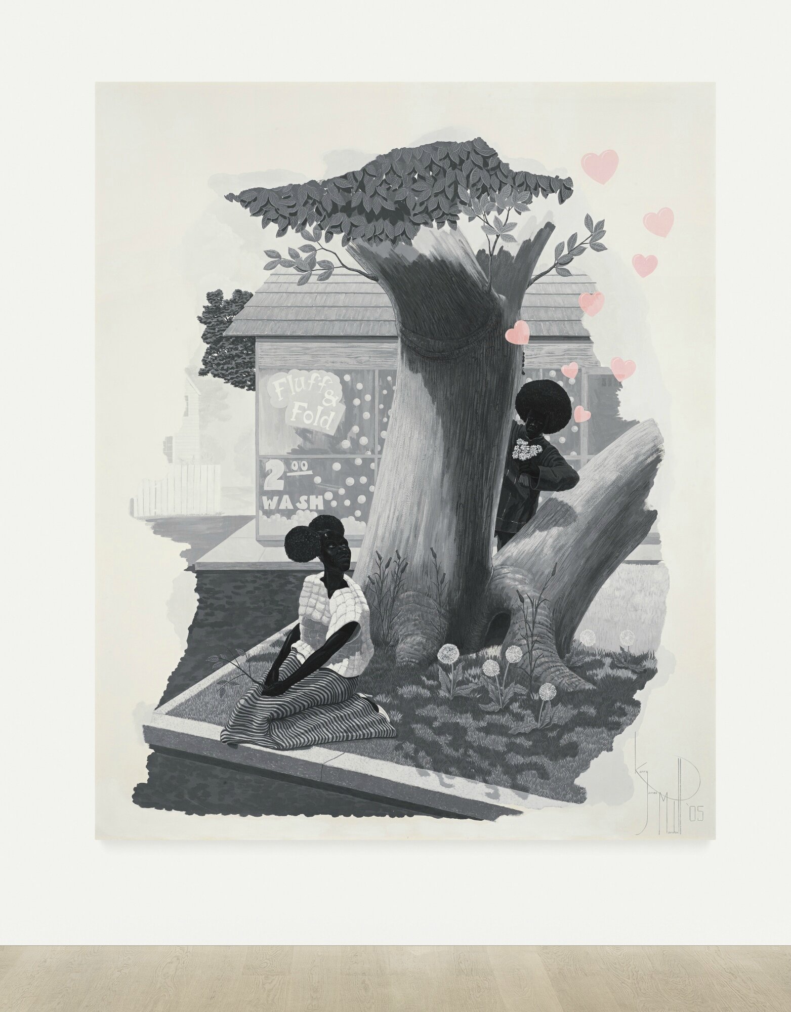
Lot 19. Kerry James Marshall (B. 1955), Vignette #5, signed and dated '05, acrylic on Plexiglas, 72 by 60 in. 182.9 by 152.4 cm. Estimate 500,000 — 700,000 USD. Lot sold 970,000 USD. Photo Sotheby's.
Provenance: Jack Shainman Gallery, New York
Acquired from the above by the present owner in 2006
Exhibited: London, Camden Arts Centre; Gateshead, BALTIC Centre for Contemporary Art; Walsall, The New Art Gallery; and Oxford, Modern Art Oxford, Kerry James Marshall, along the way, November 2005 - October 2006, p. 12, illustrated in color
Vancouver, Vancouver Art Gallery, Kerry James Marshall, May 2010 - January 2011, p. 36, illustrated in color

Kerry James Marshall in his Chicago studio, 2003. Photographer Unknown
Notes: KERRY JAMES MARSHALL ON THE VIGNETTES, 2003-07
"The work of African-American artists has for a long time been seen more as a kind of social phenomena instead of aesthetic phenomena. The social implications of the work — be it identity politics and things like that — seem to be privileged in terms of the way the work is received, as opposed to any kind of aesthetic project or intervention the work might be organized around...
On some level, I thought maybe the only thing that was left to do was to make paintings about love. And to take a cynical approach to the concept of love, to the concept of the Vignettes (2003-07), so that they don’t seem to directly address the social and political issues that had been relevant to me and maybe to a lot of other artists who want to make work.
I began by looking at a lot of 18th Century French painting — Rococo work — like Boucher, Fragonard, Bouguereau, and other artists who themselves are also critiqued but critiqued for a lack of political depth in their work, for the frivolity of the work and for the work being kind of saccharine and sentimental and overly puffy and flowery. I started to take those two things and see if I could put them together — to preserve a certain element of the social, political, and historical narratives that are still important to me, but also to deal with the sentimentality, frivolity, and excesses that are embedded in Rococo painting...
One of the reasons I use the grisaille technique in those paintings was to deny a bit of the Rococo. If you take a genre of painting that’s recognized for being pretty or flowery, but you want to start to do some other things, then you have to strip away some of those characteristics. One of the first characteristics is the over-investment in color that those pictures would have. So I stripped away the color, which reduces a certain amount of sweetness in the pictures. Black and white always tends towards a level of seriousness, and you can use it to avoid sentimentality when you’re dealing with highly keyed chromatic kind of relationships. The only color note in there is the cartoony pink in the hearts. The pink is a way of refusing to deliver on all of the points of which grisaille is supposed to deliver. And I chose to paint the hearts pink specifically to emphasize the disconnection between the overtly romantic imagery in the foreground and the historical or political imagery in the background."
Kerry James Marshall quoted in an interview with Wesley Miller, Art21 Magazine, September 2008
o Christian Marclay’s Boneyard sells for $550,000 – an auction record for the artist.

Lot 44. Christian Marclay (B. 1955), Boneyard, hydrostone casts of telephone receivers, in 750 parts, dimensions variable. Executed in 1990. Estimate 600,000 — 800,000 USD. Lot sold 550,000 USD. Photo Sotheby's.
Provenance: Tom Cugliani Gallery, New York
Acquired from the above by the present owner in 1991
Exhibited: New York, Whitney Museum of American Art, 1991 Biennial Exhibition, April - June 1991, p. 162, illustrated
Athens, The Factory, School of Fine Arts, Everything That's Interesting is New: Works from the Dakis Joannou Collection, January - April 1996, pp. 190-191, illustrated in color
Cyprus, The Nicosia Municipal Arts Centre, Forever: Works from the Dakis Joannou Collection, November 2001 - March 2002, p. 45, illustrated (in installation at The Factory, School of Fine Arts, Athens, 1996)
Los Angeles, UCLA Hammer Museum; Annandale-on-Hudson, New York, Bard College Center for Curatorial Studies; Seattle, Seattle Art Museum; Thun, Kunstmuseum Thun; Avignon, Collection Lambert; and London, Barbican Art Gallery, Christian Marclay, May 2003 - May 2005, p. 57, illustrated in color (detail)
Athens, Technopolis, 1st Athens Biennial 2007: Destroy Athens, September - November 2007, p. 143, illustrated
Athens, DESTE Foundation for Contemporary Art, Alpha Omega, June - December 2010, pp. 30-31, illustrated
Literature: Ken Johnson, "Report from New York: Generational Saga," Art in America, June 1991, p. 49, illustrated (in installation at the Whitney Museum of American Art, New York, 1991) and p. 45 (text)
Christopher Knight, "Leading the eye by the ear," The Los Angeles Times, June 3, 2003 (text)
Carol Diehl, "Mixmaster," Art in America, September 2003, p. 90, illustrated in color (in installation) and p. 91 (text)
Eva Forgacs, "The Work of Art in the Age of Digital Reproduction," X-Tra, Vol. 6, No. 1, Fall 2003, p. 32 (text)
Philip Sherburne, "Christian Marclay's Cochlear Implants," Parkett, Vol. 70, Zurich and New York, 2004, p. 24 (text)
Exh. Cat., Athens, DESTE Foundation for Contemporary Art, Monument to Now: Works from the Dakis Joannou Collection, 2004, p. 266, illustrated in color
Exh. Cat., Paris, Musée de la Musique (and travelling), Replay: Marclay, 2007, p. 101, fig. b, illustrated
Jackie Battenfield, The Artist's Guide: How to Make a Living Doing What You Love, Philadelphia, 2009, p. 30, illustrated (in installation, twice) and p. 30 (text)
Note: "[Boneyard]reconfirms Marclay’s vision of the phone as a repository of all the voices once travelling through, and now buried within.” Eva Forgacs, "The Work of Art in the Age of Digital Reproduction," X-Tra, Vol. 6, No. 1, Fall 2003, p. 32
Lot 44. Christian Marclay (B. 1955), Boneyard, hydrostone casts of telephone receivers, in 750 parts, dimensions variable. Executed in 1990. Estimate 600,000 — 800,000 USD. Lot sold 550,000 USD. Photo Sotheby's.


/http%3A%2F%2Fstorage.canalblog.com%2F17%2F17%2F119589%2F113145923_o.jpg)
/http%3A%2F%2Fstorage.canalblog.com%2F54%2F22%2F119589%2F113128639_o.jpg)
/http%3A%2F%2Fstorage.canalblog.com%2F35%2F70%2F119589%2F112637670_o.jpg)
/http%3A%2F%2Fstorage.canalblog.com%2F31%2F51%2F119589%2F112516875_o.jpg)