

/https%3A%2F%2Fprofilepics.canalblog.com%2Fprofilepics%2F1%2F0%2F100183.jpg)
/https%3A%2F%2Fstorage.canalblog.com%2F03%2F02%2F119589%2F96711876_o.jpg)
/https%3A%2F%2Fstorage.canalblog.com%2F11%2F31%2F119589%2F94773502_o.jpg)
/https%3A%2F%2Fstorage.canalblog.com%2F20%2F83%2F119589%2F94772815_o.jpg)
/https%3A%2F%2Fstorage.canalblog.com%2F26%2F72%2F119589%2F75604929_o.jpg)
/https%3A%2F%2Fstorage.canalblog.com%2F59%2F60%2F119589%2F26458628_o.jpg)
Irma Boom: Designing the world's most beautiful books

Irma Boom (photo Tejo Krijgsman)
When Irma Boom suggested designing a book in an unusually squat size and shape, it didn't go down well with the publisher. Nor did her insistence that it should have a white cover, raggedy page edges and an introductory essay printed in type that starts off big and becomes smaller on successive pages.

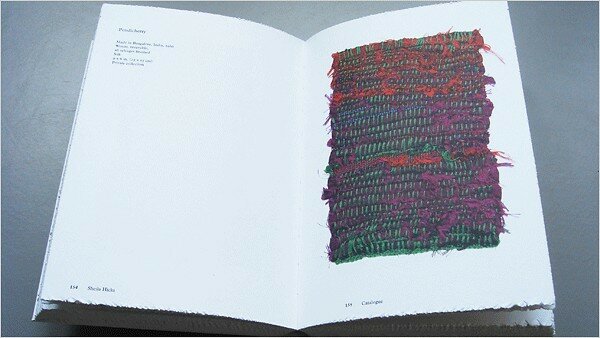
"But they were courageous and, finally, let me do it," said Boom. The result, "Sheila Hicks: Weaving as Metaphor," was published last year by Yale University Press to accompany an exhibition of Hicks's textiles at the Bard Graduate Center in New York.
It has since won a shoal of design prizes, and on Friday is to be awarded the Gold Medal at the Leipzig Book Fair for "The Most Beautiful Book in the World."

Winning prizes is nothing new for Boom. Working with a single assistant in her Amsterdam studio, she is also accustomed to struggling - in one way or another - to make each of her books as inspiring and surprising as possible. Spread from a book on European flags, designed by Boom.

Over the years, she has experimented with everything from elaborate color-codes and hidden motifs to scented bindings, printing on filter coffee paper, producing a 2,136-page book with no page numbers or index, and hacking page edges with a circular saw. (Cover of a book on European Flags, designed by Boom.)

Unexpected though Boom's books look, feel and smell, there is always an underlying logic to their design. (Cover of a book on Ferraris designed by Boom)

"She finds formats and materials that perfectly match her subjects. Her books are beautiful, satisfying objects that aren't simply exercises in formal skill. She uses design to deliver content in a brilliant fashion, interweaving stories, creating tension and surprise," said the graphic design historian Emily King. ("Light Years" designed by Irma Boom)

Irma Boom's award-winning tome about the history of the Dutch conglomerate SHV took up five years of Irma Boom's life, during which she invented her own paper for the project and developed backaches.

Laden with color-coding, mixes of type and page edges that depict a tulip field when seen from left to right, and a Dutch poem from right to left, the book contains found text and images but no page numbers. "It started out as a dream project," Boom said, "but became a nightmare, because of the time."

Having decided to compile the book from found text and images, she and Pijnappel scoured SHV's archives for material and traveled all over the world to find more. When Boom had to cancel the order for her first choice of paper (after being told by the Japanese producer that it would take 14 years to make) she invented her own paper.

The book emerged with 2,136 pages - but no numbers because Boom wanted people to dip in and out, rather than to read it sequentially.

SHV's centenary book, designed by Boom.

A 1993 butterfly stamp designed by Irma Boom for Royal TNT Post. "Irma is a genius at combining form and content," said the graphic design historian Emily King (photo Royal TNT Post)

A 1993 butterfly stamp by Boom (photo Royal TNT Post)

Boom always loved books but discovered book design by accident. Born in the Dutch city of Lochem in 1960, she studied painting at art school in nearby Enschede, and wandered into a lecture on books one day. Irma Boom's cover design for "False flat."

"The teacher didn't say anything about design, just showed us books and read from them," she recalled. "I joined the class and finally joined the graphic design department." A spread from "False Flat," designed by Irma Boom.
Lire l'article de Alice Rawsthorn http://www.iht.com/articles/2007/03/18/business/DESIGN19.php


/image%2F1371349%2F20260630%2Fob_86b434_21113.jpg)
/image%2F1371349%2F20260630%2Fob_75818d_21112.jpg)
/image%2F1371349%2F20260630%2Fob_e4c96f_21109.jpg)
/image%2F1371349%2F20260629%2Fob_4cbfa3_c0f3aa14bb7f2798fbf59cdb3aa9159f.jpg)