

/https%3A%2F%2Fprofilepics.canalblog.com%2Fprofilepics%2F1%2F0%2F100183.jpg)
/https%3A%2F%2Fstorage.canalblog.com%2F03%2F02%2F119589%2F96711876_o.jpg)
/https%3A%2F%2Fstorage.canalblog.com%2F11%2F31%2F119589%2F94773502_o.jpg)
/https%3A%2F%2Fstorage.canalblog.com%2F20%2F83%2F119589%2F94772815_o.jpg)
/https%3A%2F%2Fstorage.canalblog.com%2F26%2F72%2F119589%2F75604929_o.jpg)
/https%3A%2F%2Fstorage.canalblog.com%2F59%2F60%2F119589%2F26458628_o.jpg)
Rothko & The Abstractionists: First major canvas by Rothko at a London auction in a decade
LONDON.- The first major canvas by Mark Rothko to be presented in a London auction in a decade, the spectacular Untitled was executed in 1955 (estimate on request). Realised at the height of the artist’s celebrated classic period, it forms part of a series of abstract works exhibited and owned by a number of major international museums. Rendered in a palette of brilliant red vermillion, burnt ochre and white, Untitled comprises two rectangular forms floating within the canvas. Faced with this large-scale and vivid piece, ‘abstract sublime’ and ‘spiritual awe’ are amongst the terms used to describe this work which inevitably provokes a wealth of emotions for the transcended viewer.
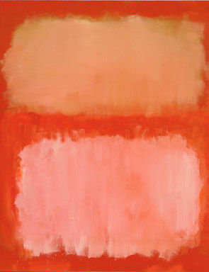
Mark Rothko (1903-1970), Untitled, signed and dated 'MARK ROTHKO 1955' (on the reverse), oil on canvas, 69¼ x 61¾in. (175.8 x 157cm.). Painted in 1955. Christie's Images Ltd 2012
Provenance: Estate of the Artist.
Marlborough A.G., Liechtenstein Marlborough Gallery Inc., New York.
Galerie Beyeler, Basel.
Barbara Wescott Collection, Rosemont (acquired in 1972).
Her sale, Sotheby's New York, 20 October 1977, lot 226.
Jeffrey Loria, New York.
The Pace Gallery, New York (acquired in 1979).
The Oliver-Hoffmann Family Collection, Chicago.
The Pace Gallery, New York.
Acquired from the above by the present owner in 1994.
Literature: D. Anfam, Mark Rothko The Works on Canvas Catalogue Raisonné, New Haven and London, 1998, no. 538 (illustrated in colour, p. 413).
Exhibited: Chicago, Museum of Contemporary Art, Three Decades: The Oliver-Hoffmann Collection, 1988-1989 (illustrated in colour, p. 23).
Notes: Previously part of the Oliver-Hoffman Family Collection, Untitled is a majestic, large-scale painting realised at the height of Mark Rothko's celebrated classic period. Executed in 1955, the year after the artist's breakthrough exhibition at the Art Institute of Chicago, it belongs to a noble series of works, the majority of which are now held in major international museum collections including the Museum of Modern Art, New York, the National Gallery of Art, Washington D.C., the San Francisco Museum of Modern Art, Museum Ludwig, Cologne, The Israel Museum, Jerusalem, the Walker Art Centre, Minneapolis and Museo Nacional de Bellas Artes, Buenos Aires. Rendered in a palette of brilliant red vermillion, burnt ochre and white,Untitled radiates like a beating heart from the canvas. It has a profound gravity to it, the viewer being drawn in by the painting's luxuriant surface, human scale and enveloped by its warm, sensual palette. Two rectangular forms hover in the centre of the canvas whilst another halo of red rises up through the many veils of Rothko's translucent paint. Each shape is rendered with a wealth of expressive brushstrokes, the edges disintegrating into a flurry of gestures created by the tip of his brush. Like clouds passing through a sublime crimson sky, the painting conjures up a sense of spiritual awe. Indeed this condition, the emotional response to Rothko's painting is fundamental to his practice. In an interview carried out with Selden Rodman, Rothko once explained: 'I'm interested only in expressing the basic human emotions - tragedy, ecstasy, doom, and so on. And the fact that a lot of people break down and cry when confronted with my pictures shows that I can communicate those basic human emotions... The people who weep before my pictures are having the same religious experience I had when I painted them. And if you, as you say, are moved only by their colour relationship, then you miss the point' (M. Rothko quoted in J. Baal-Teshuva, Mark Rothko 1903-1970: Pictures as Drama, Cologne 2003, p. 57).
Rothko was a great master of colour, marrying tones and hues together with seamless dexterity. The artist himself however, was deeply reticent about being characterised as a colourist. Instead, as he once discussed with Elaine de Kooning, he felt colour should be 'merely an instrument' (M. Rothko quoted in J. Baal-Teshuva, Mark Rothko 1903-1970: Pictures as Drama, Cologne 2003, p. 57), supplanting the line in the service of painting. His method of application of paint is what establishes the spectacular effect in Untitled. Rothko exploits the visual possibilities of the ground layer, building up the raw canvas with a combination of colour pigments and binder. Rothko began by brushing a thin layer onto his surface, subsequently fixing the foundation with oils. Onto this 'three-dimensional', primed ground Rothko then applied overlapping tones to offer a transparent and luminescent quality. It is through these sequential, thinned, transparent layers that we experience Rothko's majestic colour, each hue acting in concert with the other. As Mancusi-Ungaro has observed this is a technique borrowed from the old master painters who often used white grounds to heighten the translucency of their oil paint. As Velázquez did in hisThe Rokeby Venus (c. 1651), the white layer sequestered beneath the rich burgundy surface gives the central figure of Venus a pronounced luminescence. This sense of radiance or internal light is something that Rothko has perfected in Untitled.
Perhaps most essential to his approach, is the effect of the painted edge. In Untitled, colour laps over the sides of the painting so that the viewer standing in front of the canvas at an optimal distance of eighteen inches is consumed by colour. As Rothko elucidated, 'I paint very large pictures. I realise that historically the function of painting large pictures is painting something very grandiose and pompous. The reason I paint them, however - I think it applies to other painters I know - is precisely because I want to be very intimate and human. To paint a small picture is to place yourself outside you experience, to look upon an experience as a stereopticon view or with a reducing glass. However, you paint the larger picture, you are in it. It isn't something you command' (M. Rothko quoted in quoted in J. Baal-Teshuva, Mark Rothko 1903-1970: Pictures as Drama, Cologne 2003, p. 46).
Just as Monet had achieved in his water garden scenes from Giverny in the 1920s, Rothko sought to totally immerse the viewer in the evanescence of colour. The most compelling painting he ever encountered was Matisse's The Red Studio, which he studied almost every day when it was first acquired by the Museum of Modern Art, New York. As he explained, when you looked at it, 'you became that colour, you became totally saturated with it' (M. Rothko quoted in J. Gage, 'Rothko: Colour as Subject', J. Weiss (ed.), Mark Rothko, exh. cat., National Gallery of Art, Washington D.C., 1998, p. 261). It was this experience in front of Matisse's work that led Rothko to request his own large format paintings be hung low at the Art Institute of Chicago in 1954. He explained to the curator Katharine Kuh that his paintings should be 'first encountered at close quarters, so that the first experience is to be within the picture' (M. Rothko, quoted in J. Gage, 'Rothko: Colour as Subject', J. Weiss (ed.), Mark Rothko, exh. cat., National Gallery of Art, Washington D.C., 1998, p. 261). Encountering the painted canvas at this intimate distance induces a specific psychological effect, the edges grayed off in one's peripheral vision. As Andre Forge has elaborated, 'the moment colour and scale begin a dialogue, a close viewing range is like opening a door into an internal realm' (A. Forge quoted in J. Gage, 'Rothko: Colour as Subject', J. Weiss (ed.), Mark Rothko, exh. cat., National Gallery of Art, Washington D.C., 1998, p. 262).
In Untitled, figurative allusions emerge from the artist's panoply of colour. Indeed the lure of landscape in Rothko's work is almost unavoidable. In 1958, just a few short years after Rothko painted Untitled, Elaine de Kooning described Rothko's large canvases as offering the physical experience of 'atmospheric pressure' and 'ominous, pervasive light' as if preceding a hurricane. Indeed in Untitled his rectangular forms do have a sense of the hot, swollen energy of a storm (J. Weiss, 'Rothko's Unknown Space', J. Weiss (ed.), Mark Rothko, exh. cat., National Gallery of Art, Washington D.C., 1998, p. 305). This was a parallel that Robert Rosenblum drew early in the 1960s when he considered the works of some of the Fifteen Americans including Rothko, Jackson Pollock, Barnett Newman and Clyfford Still, as being descended from eighteenth century Romanticism and the notion of the sublime: 'a quasi-religious state of awe induced by the experience of nature on a vast scale' (J. Weiss, 'Rothko's Unknown Space', J. Weiss (ed.),Mark Rothko, exh. cat., National Gallery of Art, Washington D. C., 1998, p. 305). According to Rosenblum the representations of infinite, unbounded space in the work of J.M.W. Turner and Caspar David Friedrich resonate with Rothko's majestic canvases. In Untitled, the viewer stands in front of the painting with the same wonderment as the small figure depicted alone, in front of the staggering landscape. Rosenblum described it as the 'Abstract Sublime... We ourselves are the monk before the sea' he suggested, 'standing silently and contemplatively before these huge and soundless pictures as if we were looking at a sunset or a moonlit night' (R. Rosenblum quoted in J. Weiss, 'Rothko's Unknown Space', J. Weiss (ed.), Mark Rothko, exh. cat., National Gallery of Art, Washington D.C., 1998, p. 305).
Following the world record price achieved for his Kerze in our October auctions and the accompanying high prices set for Gerhard Richter in the New York sales, Christie's presents an outstanding Abstraktes Bild created by the German master in 1994. A majestic painting from the finest period of the artist’s abstraction, it was executed using the spontaneous squeegee technique which reveals layers of bursting azure, emerald and mauve throughout the canvas. Monumental and atmospheric, this work expresses movement and encourages the viewers to immerse themselves in the imaginary space of the composition. The harmonious painting was shown in the historical monographic exhibition staged at the d’Offay Gallery in London in 1995 and is estimated at £5 million to £7 million.

Gerhard Richter (b. 1932), Abstraktes Bild, signed, numbered and dated '811-1 Richter 1994' (on the reverse), oil on canvas, 98½ x 78¾in. (250.2 x 200cm.) Painted in 1994. Christie's Images Ltd 2012
Provenance: Anthony d'Offay Gallery, London.
Acquired from the above by the present owner in 1996.
Property from a Distinguished Collection
Gerhard Richter Werkverzeichnis 1993-2004, exh. cat., Dusseldorf, K20 Kunstsammlung Nordrhein-Westfalen, 2005, no. 811-1 (illustrated in colour, unpaged).
Exhibited: London, Anthony d'Offay Gallery, Gerhard Richter: Painting in the Nineties, 1995, no. 23 (illustrated in colour, pp. 59 and 85).
Notes: 'Abstract paintings are fictitious models because they visualize a reality, which we can neither see nor describe, but which we may nevertheless conclude exists. We attach negative names to this reality; the un-known, the un-graspable, the infinite, and for thousands of years we have depicted it in terms of substitute images live heaven and hell, gods and devils. With abstract painting we create a better means of approaching what can be neither seen nor understood' (G. Richter quoted in R. Nasgaard, 'Gerhard Richter', Gerhard Richter: Paintings, exh. cat., Museum of Contemporary Art, Chicago, 1988, p. 107).
Rendered in a luxuriant, regal palette of emerald green and azure blue, Abstraktes Bild is a majestic painting from the finest period of Gerhard Richter's abstraction. Created in 1994 it was exhibited the following year in Gerhard Richter: Painting in the Nineties at Anthony d'Offay Gallery; an acclaimed show including works that now reside in major museum collections such as Statens Museum for Kunst, Copenhagen, The Cleveland Museum of Art, Cleveland, Tate Modern, London, National Galleries of Scotland, Edinburgh, La Caixa Foundation, Barcelona and The National Museum of Modern Art, Tokyo. Abstraktes Bild is a monumental work that enchants the viewer with its verdant colour. Palimpsests of mauve and red radiate through the beautifully worked surface in a celebration of Richter's improvised and spontaneous technique. Here this practice has been perfected, the surface bearing no signs of struggle or conflict, but rather the free flowing, intuitive gestures of the squeegee over canvas. In Abstraktes Bild, Richter has become captivated by the rhythmic application of paint in vertical planes, the lustrous medium swept from a vertiginous height to the very base of the painting in successive strokes. There is a clear sense of movement and momentum in the painting, the squeegee traversing from left to right, partially obscuring and at the same time interacting with the drenched blue at the centre of the composition. Vast antecedent layers laid down in horizontal swathes are revealed and submerged in the artist's subsequent painting. This intersection of horizontal and vertical and the intermarriage of wet-on-wet oil paint invoke a sense of the sublime; the viewer's spirit elevated through the intense visual pleasure of navigating the heroic painting's elegant contours.
Abstraktes Bild offers a profound emotive and atmospheric quality. Whilst Richter avoids the gestural, expressive intent of the generation of Informel and Abstract Expressionist painters, his work still betrays a sense of his emotional life. Avoiding any personal expression that appears too direct, he nevertheless imbues his canvases with traces of feeling. In 1994, whilst he was completing Abstraktes Bild, Richter was also engaged in a series of paintings depicting his new wife Sabine Moritz. In particular the photorealist masterpiece, Lesende demonstrates a beautiful tenderness towards its subject, light illuminating Sabine's elegant profile. This was a time of supreme contentment for the artist; in 1991 he had held his breakthrough exhibition at Tate Gallery, London and in 1993 he received a major touring retrospective Gerhard Richter: Malerei 1962-1993 curated by Kasper König. The near sublime beauty and balance of Abstraktes Bild can be understood as a reflection of this personal satisfaction. Indeed a sense of his enriched emotional life is evident in the confident gestures, radiance and majestic palette of Abstraktes Bild. As Dietmar Elger suggests, in this period' Richter attempted to take possession of his domestic happiness through a long and painterly process, as if only this would make the situation believable' (G. Richter quoted in D. Elger, Gerhard Richter: A Life in Painting, Chicago 2009, p. 327).
For Richter, his free abstraction is the product of a long investigation into the possibilities of painting spanning more than five decades. Coming full-circle from his early Tisch (1962) in which he cancelled his photorealist image with haptic swirls of grey paint, Richter began in the 1980s to freely overlay his canvases with colourful streaks and drags of pigment using his signature squeegee. As Dietmar Elger has observed, 'for Richter, the squeegee is the most important implement for integrating coincidence into his art. For years, he used it sparingly, but he came to appreciate how the structure of paint applied with a squeegee can never be completely controlled. It thus introduces a moment of surprise that often enables him to extricate himself from a creative dead-end, destroying a prior, unsatisfactory effort and opening the door to a fresh start' (G. Richter quoted in D. Elger, Gerhard Richter: A Life in Painting, Chicago 2009, p. 251).
This method was to find its purest articulation between 1989 and 1994 with large-format paintings such as Abstraktes Bild. Deconstructing the relationship between figure and ground, Richter was embracing the contingency of his medium, enjoying the effects of the spontaneous yet confident application of paint. As he once explained, 'it is a good technique for switching off thinking consciously, I can't calculate the result. But subconsciously, I can sense it. This is a nice 'between' state' (G. Richter quoted in D. Elger, Gerhard Richter: A Life in Painting, Chicago 2009, p. 251).
In Abstraktes Bild Richter creates a work that celebrates the sensual pleasures of freely applied paint and colour, just as he accomplished in 1993 with his cycle of four Grün-Blau abstracts currently held in the Museo Nacional Centro de Arte Reina Sofía, Madrid. In addition to the rich optical experience of the painting, Richter encourages the viewer to immerse him or herself in the imaginary space of the composition. He insists that 'paintings are always illusionistic' so that a line, form or colour 'is only interesting when it releases an interesting association' (G. Richter quoted in R. Nasgaard, 'Gerhard Richter', Gerhard Richter: Paintings, exh. cat., Museum of Contemporary Art, Chicago 1988, p. 107). In Abstraktes Bild the cumulative layers of non-representational paint in hues of green and blue, cannot help but evoke the lush green parkland or European pine forest drenched in rain or morning dew. Just as Claude Monet had done generations before him in his Nymphéas, Richter beautifully illuminates the shifting boundary between figuration and abstraction. Whilst Monet's immersive, shimmering images of waterlilies and reflections on the quicksilver water of the pond at Giverny pushed figuration to the brink of abstraction, emphasising the illusory aspect of the lush, textured paint itself, in Abstraktes Bild Richter has arrived at the same effect through different means.
In his most definitive elucidation of his abstract method published in the Documenta 7 exhibition catalogue in 1979, Richter explained that for him, the abstract painting is no less a representation of reality than those photorealist figurative paintings of landscapes, people or places. Rather it represents the other end of the same spectrum, depicting the unseen, unspoken, intangible reality. As he elaborated, 'every time we describe an event, add up a column of figures or take a photograph of a tree, we create a model; without models we would know nothing about reality and would be like animals. Abstract paintings are fictitious models because they visualize a reality, which we can neither see nor describe, but which may nevertheless conclude exists. We attach negative names to this reality; the un-known, the un-graspable, the infinite, and for thousands of years we have depicted it in terms of substitute images live heaven and hell, gods and devils. With abstract painting we create a better means of approaching what can be neither seen nor understood' (G. Richter quoted in R. Nasgaard, 'Gerhard Richter', Gerhard Richter: Paintings, exh. cat., Museum of Contemporary Art, Chicago 1988, p. 107).
'For Richter, the squeegee is the most important implement for integrating coincidence into his art. For years, he used it sparingly, but he came to appreciate how the structure of paint applied with a squeegee can never be completely controlled. It thus introduces a moment of surprise that often enables him to extricate himself from a creative dead-end, destroying a prior, unsatisfactory effort and opening the door to a fresh start' (G. Richter quoted in D. Elger, Gerhard Richter: A Life in Painting, Chicago 2009, p. 251).
1958 was a groundbreaking year for conceptual art, one that saw Yves Klein experimenting with the possibilities of the monochrome as a transcendental object, and Piero Manzoni with the autonomous creation of an artwork in his series of ‘achromes’. For Fontana it was a year that marked his rise to international acclaim following the success of his aniline infused works in the 29th Venice Biennale. An outstanding and groundbreaking example of Lucio Fontana's pioneering approach to Conceptual Art executed in 1958, Concetto spaziale, Forma is a direct pre-cursor to his most celebrated series of paintings, the Venezie cycle of 1961 and will be offered for sale at Christie’s London this February (estimate: £1,500,000-2,000,000). Created in earthy, atmospheric tones, the work prefigures the artist’s opulent Concetto Spaziale, Festa sul Canal Grande (1961) from the Venezie series. At 150 by 150 centimeters, Concetto spaziale, Forma lends its unprecedented and heroic scale directly to all of the paintings in the Venezie series. This was one of the first times that Fontana had ever combined ‘buchi’ (holes) and ‘pietre’ (stones) with a dense layering of colour on canvas. Of the two other works in this small group of ‘inchiostri’ realised on this scale, one is held within the permanent collection of the Louisiana Museum of Modern Art in Denmark.

Lucio Fontana (1899-1968), Concetto spaziale, Forma, signed 'L. Fontana' (lower right); signed, titled and dated '1958 Lucio Fontana "Concetto spaziale" Forma "Forma X"' (on the reverse), aniline, canvas collage, coloured glass on canvas, 59 1/8 x 59 1/8in. (150 x 150cm.) Executed in 1958. Christie's Images Ltd 2012
Provenance: Galerie Bruno Bischofberger, Zurich.
Thomas Ammann Fine Art, Zurich.
Private Collection, Cologne.
Galerie Karsten Greve, Paris.
Acquired from the above by the present owner in 1992.
Property from an important European collection
Literature: E. Crispolti, Lucio Fontana: Catalogo generale, vol. I, Milan 1986, no. 58 I 64 (illustrated, p. 225).
Brera mai vista: Due quadri di Lucio Fontana: Concetti spaziali. Forme, 1957, exh. cat., Milan, Pinacoteca di Brera, 2005 (illustrated, p. 20).
E. Crispolti, Lucio Fontana: Catalogo ragionato di sculture, dipinti, ambientazioni, vol. I, Milan 2006, no. 58 I 64 (illustrated, p. 383).
Lucio Fontana: Venice/New York, exh. cat., Venice, Peggy Guggenheim Collection, 2006 (illustrated in colour, p. 34).
Exhibited: Paris, Galerie Karsten Greve, Lucio Fontana. Peintures et sculptures, 1989-1990 (illustrated in colour, pp. 34-35).
Notes: 'When I began using the 'stones' I wanted to see if I could move forward... I thought that with the stones, the light would flow better - that it would create more the effect of movement' (L. Fontana quoted in Lucio Fontana, exh. cat., London, 1999, p. 17).
An outstanding and groundbreaking example of Fontana's pioneering approach to Conceptual Art, Concetto spaziale, Forma, executed in 1958, is a direct pre-cursor to his most celebrated series of paintings, the Venezie cycle of 1961. Created in earthy, atmospheric tones, the work prefigures the artist's opulent Concetto spaziale, Festa sul Canal Grande (1961) from the Venezie series. At 150 by 150 centimeters, Concetto spaziale, Forma lends its unprecedented and heroic scale directly to all of the paintings in the Venezie series. Indeed the composition that Fontana pioneered in Concetto spaziale, Forma, which implies a search for infinity, translates into the pictorial conceit of Concetto spaziale, Festa sul Canal Grande, with its rounded curves traversing the centre of the painting recalling the myriad canalways of the golden city. Stretched out across the width of this expansive canvas, the shadowy nebulae-like shape hovers in an atmospheric spatial void. Fontana created this sense of depth by laying down one piece of canvas on top of another. Both soaked in aniline dye, the slight difference in tone between the two creates an illusion of depth and an almost imperceptible halo surrounding the contours of the central form. Laid out across the breadth of this celestial body are a dozen small pieces of white glass as well as a pair of dark green, almost black glass fragments. This was one of the first times that Fontana had ever combined buchi (holes) and pietri (stones) with a dense layering of colour on canvas. Of the two other works in this small group of inchiostri realised on this scale, one is held within the permanent collection of the Louisiana Museum of Modern Art in Denmark.
1958 was a groundbreaking year for conceptual art, one that saw Yves Klein experimenting with the possibilities of the monochrome as a transcendental object and Piero Manzoni with the autonomous creation of an artwork in his series of achromes. For Fontana it was a year that marked his rise to international acclaim following the success of his aniline infused works in the XXIX Venice Biennale. At the Biennale, Fontana was given a sizeable room in the central pavilion and for this occasion he installed around thirty works from his early practice in the 1930s and around a dozen new works including pastels and inks. Alloway later recalled that the room was filled with some of 'the most grave and beautiful works' (L. Alloway quoted in S. Whitfield (ed.), Lucio Fontana, exh. cat., Hayward Gallery, London, 1999, p. 30). The rich aesthetic of his earlier production stood in stark contrast to the newly articulated conceptual works in aniline ink. Buoyed by the approbation he received, Fontana was determined to push forward with his 'spatialist' investigations. It was soon after that he developed his first 'taglie' (cut) upon the same aniline, inky canvas as the present work. As Alloway once suggested, 'what began as a gesture' during this key moment 'was continued and extended as a basic part of Fontana's oeuvre' (L. Alloway quoted in S. Whitfield (ed.), Lucio Fontana, exh. cat., Hayward Gallery, London, 1999, p. 30). In doing so, the artist was aspiring towards and seeking to mirror the dramatic evolutions in space travel occurring as part of the international space race.
In Concetto spaziale, Forma, Fontana introduces a new sculptural precedent in his work, playing with surface texture though his use of collage and presenting a stochastic relief with the use of stones. These elements were part of the artist's intention to open up the surface of the canvas to a multi-dimensional play of light, colour and texture. 'When I began using the 'stones,' Fontana once explained, 'I wanted to see if I could move forward... I thought that with the stones, the light would flow better - that it would create more the effect of movement' (L. Fontana, 1967, quoted in Lucio Fontana, exh. cat. London, 1999, p. 17). In Concetto spaziale, Forma, not only does the surface of the work take on a new tactile and three-dimensional quality, but it also sees Fontana seeking the fourth dimension, looking through each hole into the infinite space beyond.
In creating each hole, Fontana forcefully breached the integrity of the canvas using a sharp implement to puncture directly through the surface of the work. These ruptures, the quintessence of Fontana's practice, lend Concetto spaziale, Forma a remarkable illusion of space and unbounded depth. As the artist once explained, 'I make a hole in this canvas, which was the basis of all art and I have created an infinite dimension... Einstein's discovery within the cosmos is of the dimension opening on the infinite, without an end. So, having already first, second and third [pictorial] planes, what must I do to go beyond? I make a hole in the canvas and the infinite comes through, light comes through, there is no need to paint' (L. Fontana quoted in E. Crispolti, 'Spatialism and Informel: The Fifties,' E. Crispolti & R. Siligato (eds.), Lucio Fontana, exh. cat., Milan, 1998, p. 146).
For Fontana, the birth of the Space Age rendered all matter and art objects, whether painting or sculpture, obsolete. He believed that in this new age, mankind would regain a new spiritual awareness that would ultimately transcend all materialist thinking. For him, the purpose of artistic practice should be radically revised to serve this end. As he concluded, 'as a painter, while working on one of my perforated canvases I do not want to make a painting... I want to open up space, create a new dimension for art... With my innovation of the hole pierced through the canvas in repetitive formations, I have not attempted to decorate a surface, but on the contrary; I have tried to break its dimensional limitations. Beyond the perforations, a newly gained freedom of interpretations awaits us, but also, and just as inevitably, the end of art' (L. Fontana quoted in J. van der Marck and E. Crispolti, Fontana, Brussels 1974, p. 7).
Concetto spaziale, Forma, can be understood in the context of the majestic Relief éponges bleu undertaken by Yves Klein and the great Achrome carried out by Piero Manzoni during the same period. Together they represent the moment that artists began to privilege the concept over composition, using the realised work as a vehicle for their ideas. Concetto spaziale, Forma marks the beginning of Fontana's great decade from 1958-1968, which saw him leave behind Art Informel in favour of the conceptual work that was to become his hallmark. Over the course of this period he transformed the entire artistic landscape and Concetto spaziale, Forma can be understood as the turning point in this radical trajectory.
A student of Lucio Fontana from his time at the Academia Altamira in Buenos Aires, Sergio Camargo learnt a great deal from his teacher’s pure, conceptual aesthetic. Executed in 1970, Relief no. 259 is a signature, radiant, white, sculptural work by Brazilian artist Camargo (estimate: £400,000-600,000). The long horizontal aperture cleared through the wealth of cylindrical wooden pieces in Relief no. 259, recalls Fontana’s own slashes, cutting into the monochrome canvas to reveal the space beyond. In Relief no. 259, the wooden pieces create a dynamic play of shadows as light penetrates and illuminates different facets of the work. Relief no. 259 was created at the height of Camargo’s career, whilst he was staying in Paris forming associations with artists such as Jean Arp, Henri Laurens and Constantin Brancusi. Camargo’s first white relief was executed in 1963 when the artist was thirty-three. This is the first time that a work of art by Camargo is offered for sale at Christie's London.

Sergio Camargo (1930-1990), Relief no. 259, signed and titled 'Camargo n° 259' (on the reverse), oil on wood construction, 31 3/8 x 31 3/8 x 4 7/8in. (79.7 x 79.7 x 12.5cm.) Executed in 1970. Christie's Images Ltd 2012
Provenance: Gimpel Fils, London.
Ronnie Shapiro, New York.
Private Collection, Chicago.
Private Collection, Paris.
Acquired from the above by the present owner.
Exhibited: London, Gimpel Fils Gallery, Sergio Camargo, 1970, no. 11, p. 17 (dated 1969).
Notes: 'I have been working exclusively with white since 1963, first with wood which I painted and recently with a pure white marble. My use of white is therefore more a constant theme than a particular phase. Having never been a painter it may be that my choice of white for my reliefs and sculpture corresponds with a desire to annihilate the surface qualities of matter in order to accentuate the power of structures which work together through interpenetration of light and space...' (S. Camargo quoted in L. Milton (ed.), Basically White, Institute of Contemporary Art, London 1974, p. 18).
Executed in 1970, Camargo's Relief no. 259 is a signature, radiant, white, sculptural work by Brazilian artist Sergio Camargo. The student of Lucio Fontana from his time at the Academia Altamira in Buenos Aires, Camargo learnt a great deal from his teachérs pure, conceptual aesthetic. Indeed, the long vertical aperture cleared through the wealth of cylindrical wooden pieces in Relief no. 259, recalls Fontana's own slashes, cutting into the monochrome canvas to reveal the space beyond. In Relief no. 259, the wooden pieces create a dynamic play of shadows as light penetrates and illuminates different facets of the work. As Guy Brett has described, the work 'becomes a kind of white mould into which light seems to imprint its natural rhythm; it bears the traces of each slight transformation as clean morning light changes to plain afternoon light and later to elusive evening light. It is not there to tell us anything but to return, amplified, what we bring to it' (G. Brett quoted in Sergio Camargo: Light and Shadow, São Paolo 2007, p. 23).
Relief no. 259 was created at the height of Camargo's career, whilst he was staying in Paris forming associations with artists such as Jean (Hans) Arp, Henri Laurens and Constantin Brancusi. His work, although grounded in what has been described as the 'Brazilian feeling for organic life and physical ease of movement' (G. Brett quoted in Sergio Camargo: Light and Shadow, São Paolo 2007, p. 59) also retains the logical clarity and conceptual acuity of his contemporaries. Each work results from a calculated balance of order and disorder, reengaging the tradition of Constructivist aesthetics and invigorating old geometries with the lyricism of organic form.
Camargo's first white relief was executed in 1963 when the artist was thirty-three. The discovery of his sculptural vernacular was entirely incidental; one day whilst cutting an apple, he sliced off nearly half the fruit and made an additional cut at a different angle to take a piece to eat. The resulting planes made a neat relationship of light and shadow, and it was this discovery that gave Camargo the concept for his wooden, cylindrical elements. These simple shapes became the very foundations for his work, the art lying in their rhythmic application to board. In each piece, Camargo would vary the size, concentration, direction and angle of each wooden element to create a unique, undulating relief. In Relief no. 259, the wooden pieces lie at complementary angles to one another, their pattern of light suggesting vibration and kinetic movement like the wind rushing through tall grass. In the empty white band at the centre of the work, there seems to be no movement, the bare board appearing static in contrast to the sensuous interplay of cylindrical elements in either wing.
For Camargo, the investigation of volume is the most important element of his practice. In Relief no. 259, the artist has created a work that appears to disintegrate volume, shattering it with light. Whilst the real, physical properties of each curved piece never change, the apparent volume becomes increasingly vague as light interacts with each white surface. In painting the work exclusively white, Camargo was seeking to eliminate all other considerations apart from the dialogue between mass and light. As Brett has noted, 'the white solids are not felt as solids; the shadows and relations are felt, more strongly, and these are the immaterial traces of the elements volume. Volume, in Camargo's reliefs, though in reality it exists, is perceived as virtual' (G. Brett quoted in Sergio Camargo: Light and Shadow, São Paolo 2007, p. 23).
Agrigente is an extraordinary abstract landscape which forms part of the renowned series of ‘Agrigente’ paintings by Nicolas de Staël, regarded as the most important ever produced by the Russian-born artist. This particular work, which was realised in Provence in August 1953, on his return from a visit to Agrigento, Sicily, is one of the largest paintings from the series and is indeed a masterwork. The thick impasto is applied with a palette knife in a technique honed down by the artist, fully emphasising the large juxtaposed strips of vivid colour. De Staël unusually signed, titled and dated the piece on its reverse, revealing its particular importance. This work is estimated to realise £3.5 million to £5 million, in line with the current record price for the artist at auction (€7,033,418 / US$9,423,121).

Nicolas de Staël (1914-1955), Agrigente, signed 'Staël' (lower left); signed, titled and dated 'Agrigente Août 1953 Staël' (on the reverse), oil on canvas, 35 1/8 x 51¼in. (89.2 x 130cm.). Painted in 1953. Christie's Images Ltd 2012
Provenance: Jacques Dubourg Collection, Paris.
Ira Haupt Collection, New York.
Galerie Berggruen, Paris.
Pierre Matisse Gallery, New York.
David E. Bright Collection, Los Angeles.
Literature: J. Dubourg and F. de Staël, Nicolas de Staël, catalogue raisonné des peintures, Paris 1968, no. 677 (illustrated, p. 291).
F. de Staël, Nicolas de Staël, Catalogue raisonné de l'oeuvre peint, Neuchâtel 1997, no. 732 (illustrated, p. 480).
Exhibited: Saint-Paul, Fondation Maeght, Nicolas de Staël, Rétrospective de l'oeuvre peint, 1991, no. 53, p. 200 (illustrated in colour, p. 145). This exhibition later travelled to Madrid, Museo Nacional Centro de Arte Reina Sofía (illustrated in colour, p. 147).
Martigny, Fondation Pierre Gianadda, Nicolas de Staël 1945- 1955, 2010, no. 50 (illustrated in colour, pp. 148-149).
Notes: 'De Staël... was a master at reducing things to essentials and his painting is never rhetorical or overloaded. Being a very fine painter, as well as a painter who loved broad effects, he could manage with a few carefully chosen shapes and subtle tonalities... to convey an extraordinarily full visual experience' (D. Cooper, Nicolas de Staël, London 1961, p. 73).
AGRIGENTO
With its dominating horizontal planes of cerulean blue and lemon yellow powerfully suggesting a broad expanse of land and sky, this painting, Agrigente is one of the earliest, largest and most ambitious examples of arguably the most important series by Nicolas de Staël. It is also a work that is unique among them in that de Staäl has signed, titled and dated it on its reverse: Agrigente, Août, 1953 (Agrigento, August, 1953). This is a date that refers not to the time of the painting's execution, but also to the time of de Staël's visit to Agrigento. The painting, like all the others in the series, was executed from memory in Provence sometime after de Staël's return to France towards the end of September 1953. The unique and specific dating of this work may well indicate that it was one that de Staël found, on its completion, to be especially evocative of the precise atmosphere of Agrigento at the time when he had visited it.
In the summer of 1953 de Staël, recently returned from a triumphant exhibition in New York where he had been lauded as the leading European artist of his generation, set off with his wife, family and two friends on a tour of Sicily and Southern Italy. On their return to Southern France a month or so later, de Staël began a series of paintings inspired by the raw and radiant Sicilian landscape he had seen and sketched around the ruins of the ancient Greek city of Agrigento. This ancient landscape with its magnificent 6th Century B.C. ruins became a central, almost icon-like motif in de Staëls work over the ensuing months, providing the inspiration for a series of over twenty paintings that, on their completion, were immediately recognised as being among the very greatest of all the artist's achievements.
Agrigente was painted in the warmth and light of the South of France and it is this sense, the very essence of the Mediterranean that is distilled into his painting. The climate, light, colour and coastal landscape of the Mediterranean combined with its ancient cultural history all proved vital to pushing de Staëls pure way of painting to further intensifications than those previously seen in his work. De Staëls Agrigente paintings are works that both heroify the rich, intensified colours of the Mediterranean as well as concretise them - through an emphasis on their material texture - into intense but refined and perfectly balanced painterly constructions. As the collector and critic Douglas Cooper who befriended de Staël when he became a neighbour in Provence on his return from Italy in 1953 recalled of these works, de Staël was 'a master at reducing things to essentials ... Being a very fine painter, as well as a painter who loved broad effects, he could manage with a few carefully chosen shapes and subtle tonalities... to convey an extraordinarily full visual experience' (D. Cooper, Nicolas de Staël, London 1961, p. 73).
BETWEEN FIGURATION AND ABSTRACTION
In Agrigente de Staël has realised his composition using rich swathes of pure, thick, oil colour generously applied with a palette knife and magically organised into dynamically intersecting but ultimately coherent structures. This vibrant and epic landscape marks the painterly culmination of a unique adventure into the fusion of abstraction and figuration that de Staël first embarked upon in Paris two years earlier. As he wrote to his friend Jacques Dubourg from Rome shortly after visiting Sicily, along with some antiquities in the Musée du Syracuse, his visit to Agrigento had proved the 'highpoint' of his entire summer.
This 'highpoint' was to act as the catalyst through which many of the various themes and ideas that had been running through his work to date were to came to fruition. Reminiscent in some respects of the colour-intensified abstracting of landscape formerly pioneered by his fellow Russian artists Wassily Kandinsky, Kazimir Malevich and Alexei von Jawlensky, de Staëls Agrigente paintings fuse Mediterranean light with the Northern European landscape tradition, the rich colours and simplified forms of Russian icon painting with the dynamic colourism of Henri Matisse's cut-outs. Dramatizing and simplifying colour, form, material texture and an innate sensibility towards landscape, they are works that are rivaled only by the contemporary art being made on the other side of the Atlantic by another Russian-born émigré and 'heroifier' of colour: Mark Rothko.
As if to emphasize the importance of this painterly netherworld between abstraction and figuration, Agrigente is a work, like several from the series, in which de Staëls focused consideration of the vast twin abstract planes of the Sicillian landscape and Mediterranean sky have been emphasized to a startling degree. Here the hills of Agrigento and the sea have been compressed into a central strip of radiant and vibrating form between the two dominant planes of blue and yellow. As a way of emphasizing the simplicity of this design and the pleasure de Staël takes in the material nature of his painterly craft, these two dominating planes of contrasting flat colour have been made with bold, broad stokes of the palette knife. In the case of the sky, de Staël has laid it across the canvas in long canvas-width horizontal pulls of thick blue paint allowing the rifts between them to leave striated horizontal ridges of paint that encourage a sense of perspectival distance. By contrast, the hot yellow plain beneath the clear sky is plastered in thick angular slabs of yellow paint that materially build a solid sense of impermeable colour and to such a degree that its intensity seems to radiate like a heatwave rising above the plain.
THE INFLUENCE OF MATISSE
In 1953 de Staël went to see the first exhibition devoted solely to Matisse's cut- outs then on show at Heinz Bergruen et Cie. In response to seeing this exhibition, de Staël too began to work with paper cut-outs, using rough shapes of starkly contrasting coloured paper to create an intriguing series of powerful and often landscape-like abstractions. These works are clearly echoed in the autonomous blocks of colour used as 'repoussoirs' in paintings such as Agrigente. Something of the colour simplification and raw power of both Matisse's cut-outs and those de Staël himself began making at this time, informs the language of colour, material texture and form of the Agrigente pictures. Indeed, in these works, despite the less dense nature of their surfaces compared to some of de Staël's earlier abstractions, the artist has pushed his mastery of the palette knife to its furthest extreme. Not long after these works were made, de Staël would finally abandon the knife to return to the brush.
In paintings like Agrigente pure blocks of colour become the freeform driving forces of the composition, the landscape being literally carved out with a simplified elegance reminiscent of Matisse's The Snail (1953) and Memory of Oceania (1952-1953). Without any preparatory drawing, de Staël established each form on the empty white plane of the blank canvas with an apparent nonchalance and immediacy, powerfully asserting the extraordinary confidence the artist held in his own mastery. Indeed, such is the artist's command of his medium and his awareness of the requirements of the composition as a whole that much of the drama and the energy of the picture appears to take place in and between these swiftly executed painterly details. The material nuances of form lie where the sweeping edge of one scraped mark meets or merges with the side of another, or where two vibrantly coloured and intuitively-swept strokes articulate a jagged and electrifying strip of raw white light in the form of the bare primed canvas.
Each of these autonomous marks asserts the impulsive, contingent sense of painterly intuition and dynamic interaction that is a hallmark of de Staël's practice. Each abstract mark asserts a vitality and independence on the canvas surface that speaks of the gestural act of painting whilst nevertheless adhering - just - to a representational function. Hovering on the very brink of abstraction, to paint like this was a delicate balancing act that de Staël suggested could induce in him a sense of 'vertigo'. 'I want my painting... to be like a tree, like a forest' he once said, 'One moves from a line, from a delicate stroke, to a point, to a patch...just as one moves from a twig to a trunk of a tree. But everything must hold together, everything must be in place' (N. de Staël quoted by R. van Gindertaël, in Cimaise, no.7, June 1955, pp. 3-8).
A NEW FOUND PERSPECTIVE
As Douglas Cooper wrote, such works as this marked the culmination of a two-year period of intense and rapid development in which de Staël's painting grew ever more spectacular in its reductive power. 'Throughout the period from the summer of 1952 to the spring of 1954 de Staël's development was rapid. His pictorial invention was harnessed to a great effort, and in everything he produced one feels the force of his originality and vitality. Gradually he simplified his method of composition until, with four or five broad areas of colour he could evoke not merely the constituent elements of a landscape - sky, hills, buildings and a road for example - but even a harbour with boats, a lighthouse among the dunes, or a nude reclining on a divan. Now, in these landscapes and seascapes, de Staël often composed on the Impressionist principle of parallel planes laid out one above the other. But occasionally - as in Agrigente or La Route d'Uzès - he had recourse for the first time to a summary type of linear perspective which carries the eye back to a focus of interest generally arbitrarily placed and marked by a flurry of paint. In addition, de Staël tends to accentuate this perspective by placing in the foreground of his picture one or more repoussoirs (counterpoints) which may or may not be representational but are always strong in tonality. (D. Cooper, op. cit., pp. 62-63).
With their powerful immediacy and sense of resonant simplicity, the Agrigente paintings along with his La route d'Uzés series from this period ultimately serve as pictorial manifestos supporting de Staël's firmly-held belief that abstraction and figuration need not be opposites, but in fact complimentary. Indeed, it was precisely this refined balance between abstraction and figuration, so elegantly achieved in de Staël's paintings of 1953 and 1954 that has proved one of the artist's lasting legacies. De Staël's ability to fuse abstraction and figuration into a unique form of painting, speaking of the magic and mystery of the medium is one that was to have a profound impact in the 1950s on painters like Frank Auerbach. Like Auerbach, de Staëls magisterial command of his medium and willingness to let the autonomous plastic quality of his paint assert itself whilst performing its illusionary or figurative function, is a powerful example of the painterly play between figuration and abstraction being pursued by many 'post-modernist' painters today, not least among them artists such as Peter Doig and Gerhard Richter.' I do not set up abstract painting in opposition to figurative' de Staël was careful to explain, 'a painting should be both abstract and figurative: abstract to the extent that it is a flat surface, figurative to the extent that it is a representation of space' (N. de Staël quoted in R. van Gindertael, Nicolas de Staël, Galerie Beyeler, Basel, 1966, translated in Nicolas de Staël in America, exh. cat., Washington D.C., 1990, p. 22).
As Douglas Cooper has explained, the miracle of de Staël's work at its finest, was that as in Agrigente he was somehow able to express 'delight in what he saw, and the thrill of experiencing the thousand vibrations' (to quote his own expression) to which his volatile and sensitive nature was open.' All of these were reasons, Cooper concluded, that 'to my mind, enabled Nicolas de Staël to become the most considerable, the truest and the most fascinating young painter to appear on the scene, in Europe or elsewhere, during the last twenty-five years.' (D. Cooper, op. cit., p. 7).


/image%2F1371349%2F20260904%2Fob_0e645d_34583.jpg)
/http%3A%2F%2Fstorage.canalblog.com%2F19%2F28%2F119589%2F133595388_o.png)
/http%3A%2F%2Fstorage.canalblog.com%2F01%2F90%2F119589%2F127173549_o.jpg)
/http%3A%2F%2Fstorage.canalblog.com%2F33%2F87%2F119589%2F126366680_o.jpg)